Parts Make the Whole
Creating a typeface out of modular parts | sophomore year
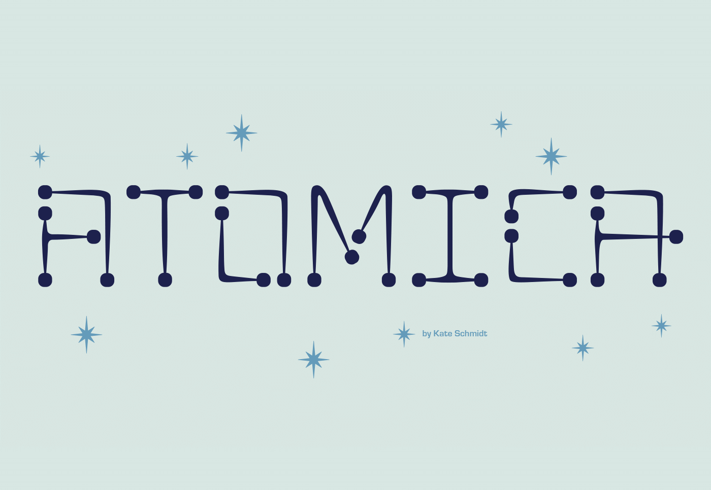
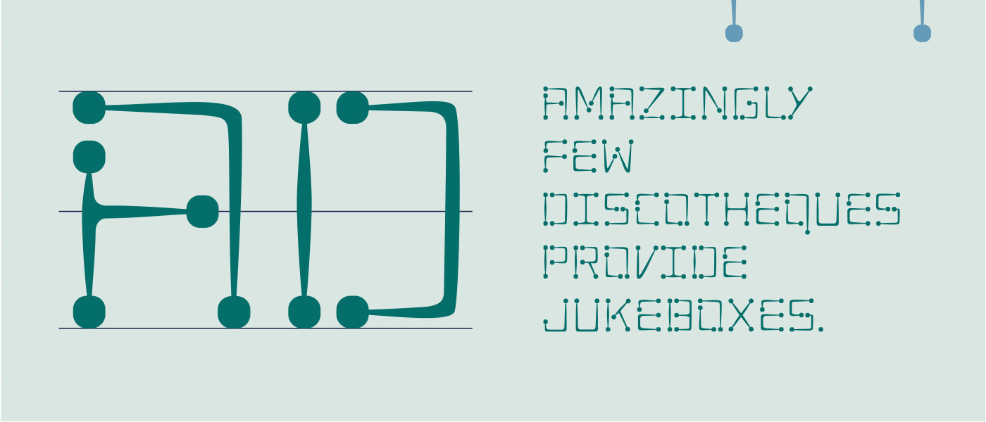
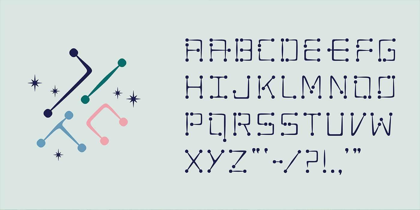
A modular typeface is an alphabet constructed out of a limited number of shapes or modules. Modular describes any letter assembled from a limited palette of distinct elements, repeated, flipped, and flopped but not scaled. Typically these elements are geometric and simple in shape—square pixels on a digital display or modernist circles, squares, and lines.
Traditionally, modular lettering has responded to the limitations and possibilities of the media used to create it. Today designers are using more ornate, complicated, and/or organic forms (modular units) and even physical objects to construct modular letters. They have taken a broader approach to modular letter-forms, pushing the possibilities to create letters from more complicated elements.
The project: Parts Make the Whole asks students to use the context of a modular letter construction to create a prototype for a modular font. A minimum of 26 upper-case or lower-case characters (you are not required to create both). You may choose to create a unicase font combining typical characteristics of upper and lower case characters. The letterforms must be modular/ rational/ repeatable forms: parts of letters are used to make other letters. You will start by designing letters on a grid of squares or a grid of dots. They may substitute the curves and diagonals of traditional letterforms with gridded and rectilinear elements. The only rules are one can not use handlettering or develop letters based on some existing font, the letters must be constructed. Avoid making detailed “staircases,” which are just curves and diagonals in disguise.
Explore the modular system. Once defined, refine the letters to something new and less expected, the new will become the system to create all 26 letters of the alphabet. Work in Adobe Illustrator and use the software Glyphs to output the final set of upper or lower case letters as a usable, shareable, typeface.
- - - - - - - - - - - - - - - - - - - - - - -
LEARNING OBJECTIVES
_ understand the anatomy of letterforms/characters/glyphs
_ explore the expressive potential of typography
_ solve communication problems within given parameters
_ methodically document relevant design inspiration and process
_ present and assess work in a visually and verbally articulate manner
_ professionally document outcomes
_ demonstrate exemplary visual craft—hand and digital
_ Adobe Illustrator (pathfinder, clean vectors)
_ Glyphs App
Full project outline on the Class Website︎︎︎


Kate Schmidt


The type workbook is a series of investigations, the content ranges from typographic studies to typesetting rules.
Learning to identify typefaces, characteristics, and type classifications. And then teaching them to us. Students become the resident expert.
The principles of what makes a good layout or series of spreads are the same design principles when you design a brand story, website, motion/animation, etc
The challenge is to imagine, design, and produce the materials for a 2-day conference on a topic based on any Ted.com/topics.
Professional Practice/ Portfolio
Development of a design portfolio. The course addresses the process of building a portfolio that meets professional standards and professional practices for designers.
Typographic Universe gives the design student an introduction to the world of type design. Designing type systematically with a focus on looking at, defining, and refining the interrelationships between forms.
Design for Good. Design Director. Students working, exploring, and expanding their skillsets to create change and impact the community.