Wednesday, Oct 4
Refine, Clean-up, Define
Glyphs
Stay Curious
FILES & LINKS
Google Drive
Glyphs app
WATCH
Gail Bichler
Anthony Bryant
Donna Payne
Yotam Hadar
Abbott Miller
History of the Letterform
CALENDAR
Wed Sept 20 ::
Mon Sept 25 :: Wed Sept. 27
Mon Oct 2 :: Wed Oct 4
Mon Oct 9 :: Wed Oct 11*
Fall Break Monday Oct 16
Wed Oct 18 Due
Glyph Spacing
Toolkit
Meet in 313 lab
GLYPHS
Refresher
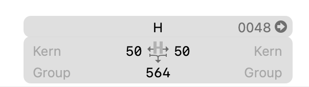
Side Bearings
![]()
Rotate, Reflect
Move arrow key 1 unit, shift 10 units, command 100 units
Primatives
Plugin Manager/ Stem Thickness
Copy and Paste from Illustrator to Glyphs
Copy and paste H or n
do these 3 things every time
Paths -> tidy up paths
Change side bearings to 50 on both sides
Clean up letter if needed
SaveAs your Glyph File
(i) File Info: Name your font
Type tooltype in HOHONO or honohn fix the spacing should look even
Copy and paste your D or d
Fix letter space HOHODHDHO onodnh spacing should look even
Can you flip your d = p or do you have to copy and paste your p into glyphs
Save often glyphs will crash so SAVE.
Keep copy and pasting your letters into Glyphs if you can flip and flop them then do that — but not required.
Make sure you look at the letter spacing for each letter as you add it to glyphs always test it as you go.
Lets make an alternate version of 1 leetter X.ss01
Upddate Features in (i)
Save, Export and test in Illustrator BEFORE YOU LEAVE FROM CLASS.
Tip
Work on your Glyphs file not the otf file :) do not open the otf file in Glyphs.
Typeface Tool Kits: develop two conceptually and visually different tool kit directions. A tool kit serves as a comprehensive resource containing the assets needed when creating your final post. By establishing clear rules to the look and feel of your tool kit, you will be equipped with everything needed for designing your Behance post.
Important Note: If AI is used to help create text or images in this project (or any project in any of your classes), it is imperative to be transparent and honest about its involvement. AI can be embraced and explored as a tool used to enhance the creative process. Maintaining mastery over the AI and making necessary alterations to all final deliverables is crucial. Failure to inform us that you are using AI at any point in the project will be considered plagiarism, and strict consequences will follow.
As we navigate this learning process, we must remember to exercise responsible AI usage and ensure that AI serves as a valuable assistant rather than a substitute for creativity and originality. Together, we can leverage AI to augment our process. Honesty and integrity could lead to a more insightful and ethical exploration of AI's potential in the creative domain.
Start thinking /planning how to show off / teach us about your typeface.
What could be a compelling way to show off your typeface? How can you show the construction/modules? What image(s) enhance the feeling or set the mood of your typeface? Do you use a pangram, a Quote, a lyric, poem, just words. For scale when desing the Behance post what Letter or Word(s) can you use to show it off? (what are your favorite letters and what words use them? if you hate a letter don’t use it :)
Testing Legibility. Test your font at different sizes so you know how SMALL you can use it in a behance post and it still look good and legible Post to your behance so you can see them in context. (and make sure you have in your process book)
![]()
Start thinking/sketching how you can show off your typeface and its characteristics. Part of the final will be 1) presenting your modular system and show how it is used, and 2) describe 3 to 6 characteristics of your typeface. You will need to visual show and verbally explain characteristics about selected letters sheet of examples | b |.
Defining personality/feeling/mood (starting Toolkits)
Write down/type up some reasons WHY you selected the final direction.
What words would you use to describe your typeface?
(sharp, soft, constructed) (scifi, romantic, futuristic, dramatic, vintage)
What is its mood? If it had an emotion/personality -- what would that be?
Make a long list ^
Pick least 3 - 6 words that describe the mood, tone, emotion, personality of your letters.
Imagery start looking for images that match or enhance or question your mood tone...
See the class syllabus for a list of image sources <-- use the list!
Toolkit
Meet in 313 lab
GLYPHS
Refresher
Side Bearings
Rotate, Reflect
Move arrow key 1 unit, shift 10 units, command 100 units
Primatives
Plugin Manager/ Stem Thickness
Copy and Paste from Illustrator to Glyphs
Copy and paste H or n
do these 3 things every time
Paths -> tidy up paths
Change side bearings to 50 on both sides
Clean up letter if needed
SaveAs your Glyph File
(i) File Info: Name your font
Type tooltype in HOHONO or honohn fix the spacing should look even
Copy and paste your D or d
Fix letter space HOHODHDHO onodnh spacing should look even
Can you flip your d = p or do you have to copy and paste your p into glyphs
Save often glyphs will crash so SAVE.
Keep copy and pasting your letters into Glyphs if you can flip and flop them then do that — but not required.
Make sure you look at the letter spacing for each letter as you add it to glyphs always test it as you go.
Lets make an alternate version of 1 leetter X.ss01
Upddate Features in (i)
Save, Export and test in Illustrator BEFORE YOU LEAVE FROM CLASS.
Tip
Work on your Glyphs file not the otf file :) do not open the otf file in Glyphs.
Typeface Tool Kits: develop two conceptually and visually different tool kit directions. A tool kit serves as a comprehensive resource containing the assets needed when creating your final post. By establishing clear rules to the look and feel of your tool kit, you will be equipped with everything needed for designing your Behance post.
Important Note: If AI is used to help create text or images in this project (or any project in any of your classes), it is imperative to be transparent and honest about its involvement. AI can be embraced and explored as a tool used to enhance the creative process. Maintaining mastery over the AI and making necessary alterations to all final deliverables is crucial. Failure to inform us that you are using AI at any point in the project will be considered plagiarism, and strict consequences will follow.
As we navigate this learning process, we must remember to exercise responsible AI usage and ensure that AI serves as a valuable assistant rather than a substitute for creativity and originality. Together, we can leverage AI to augment our process. Honesty and integrity could lead to a more insightful and ethical exploration of AI's potential in the creative domain.
Start thinking /planning how to show off / teach us about your typeface.
What could be a compelling way to show off your typeface? How can you show the construction/modules? What image(s) enhance the feeling or set the mood of your typeface? Do you use a pangram, a Quote, a lyric, poem, just words. For scale when desing the Behance post what Letter or Word(s) can you use to show it off? (what are your favorite letters and what words use them? if you hate a letter don’t use it :)
Testing Legibility. Test your font at different sizes so you know how SMALL you can use it in a behance post and it still look good and legible Post to your behance so you can see them in context. (and make sure you have in your process book)

Start thinking/sketching how you can show off your typeface and its characteristics. Part of the final will be 1) presenting your modular system and show how it is used, and 2) describe 3 to 6 characteristics of your typeface. You will need to visual show and verbally explain characteristics about selected letters sheet of examples | b |.
Defining personality/feeling/mood (starting Toolkits)
Write down/type up some reasons WHY you selected the final direction.
What words would you use to describe your typeface?
(sharp, soft, constructed) (scifi, romantic, futuristic, dramatic, vintage)
What is its mood? If it had an emotion/personality -- what would that be?
Make a long list ^
Pick least 3 - 6 words that describe the mood, tone, emotion, personality of your letters.
Imagery start looking for images that match or enhance or question your mood tone...
See the class syllabus for a list of image sources <-- use the list!
HOMEWORK
Complete all 26 characters into Glyphs either all lowercase or all uppercase. Remember, it’s possible to transform one letter into another, so utilize this technique whenever applicable (instead of copy paste it maybe faster, easier, more procise to create new in Glyphs). You have the option to draw them in Illustrator and copy and paste them into Glyphs, or you can directly draw them in Glyphs. Creating numbers and punctuation is optional.
If you encounter difficulties with certain letters, create variations of those letters. For instance, if the letter ‘s'’ is challenging, try designing a few alternative versions of it. The same applies to letters like ‘g’ or ‘w’. This is an opportunity to explore and experiment with the letters that pose difficulties. Remember, it's possible to transform one letter into another, so utilize this technique whenever applicable. Create stylistic alternate for every version so you can test in illustrator X.ss01, X.ss02 ect
Correct your spacing as you work! Look at words not letters.
Choose a name for your font and assign it in the (i) info in Glyphs.
Save your glyphs file and export it.
Test the font in Illustrator to ensure its functionality.
Type out the letters in a pangram, which is a sentence that contains all the letters of the alphabet. Save this pangram as a PDF
Bring a printed copy to class so that your letters can be reviewed. ^most of you will finish copy and pasting in class. Put your glyphs file the google drive so I can look at it and give you tips over the weekend.0
^ complete the above and ....
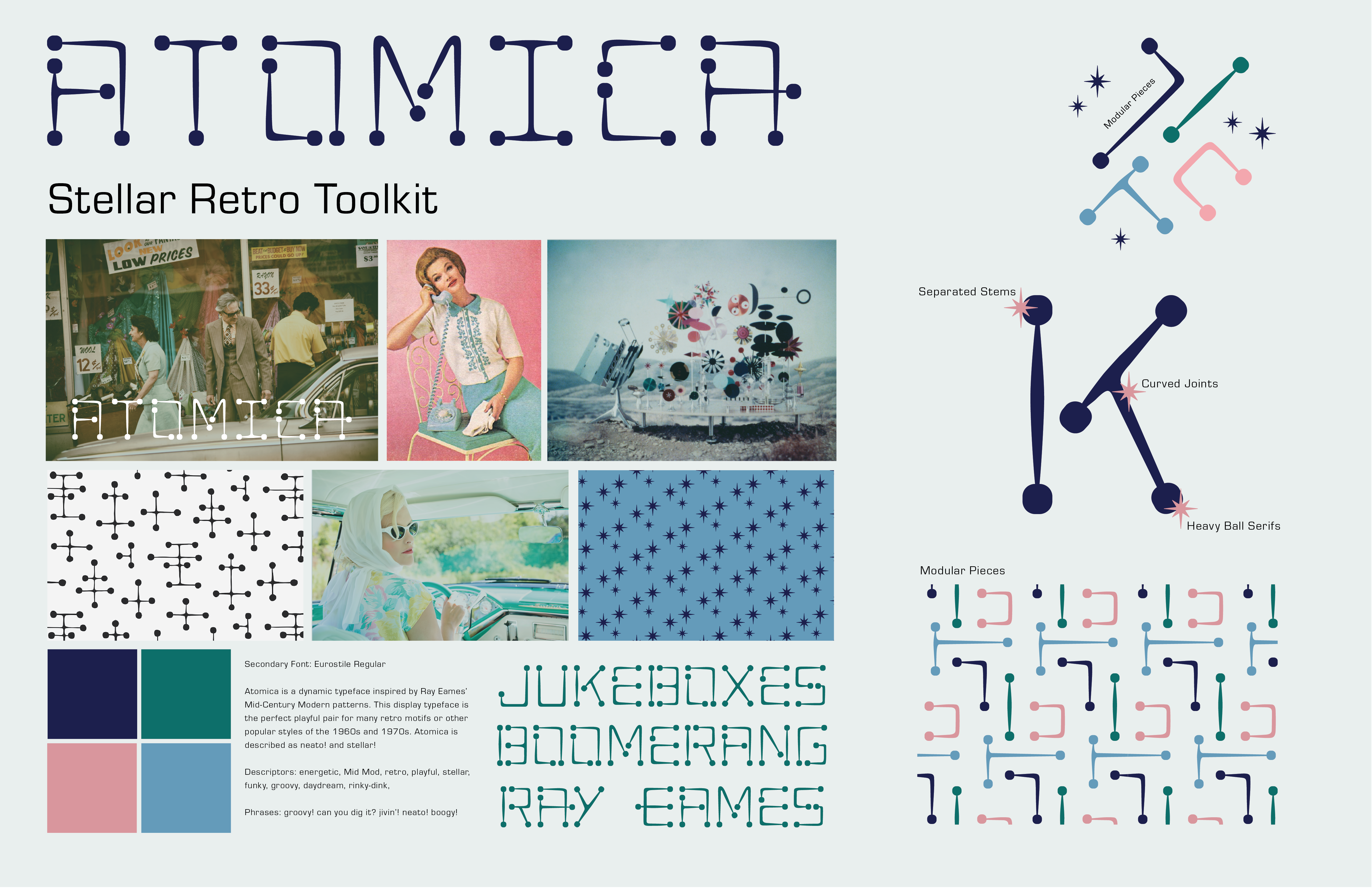
Create 2 different Tool Kits = 2 different concepts and visuals
Design the tool kits using Adobe Illustrator, ensuring they encompass the following elements:
Toolkit 1: Name the Toolkit
_ Name of the typeface:
_ Three words to describe it:
_ 4 - 6 images/illustrations: Include visuals that capture the essence of the font and reflect its _ character (you need more than you will use, curate but you need choices)
_ Color palette: Curate a selection of colors that complement the photography and evoke the desired mood.
_ Pangram/quote: Choose a pangram or a meaningful quote that showcases the versatility and effectiveness of the font in various contexts.
_ Secondary font: Your Behance Post will require a secondary font to use at small sizes
_ Modules/Construction used to create your letters: Provide insights into the construction or modular components used to develop the letters.
Toolkit 2: Name the Toolkit
_ Name of the typeface:
_ Three words to describe it:
_ 4 - 6 images/illustrations: Include visuals that capture the essence of the font and reflect its _ character (you need more than you will use, curate but you need choices)
_ Color palette: Curate a selection of colors that complement the photography and evoke the desired mood.
_ Pangram/quote: Choose a pangram or a meaningful quote that showcases the versatility and effectiveness of the font in various contexts.
_ Secondary font: Your Behance Post will require a secondary font to use at small sizes
_ Modules/Construction used to create your letters: Provide insights into the construction or modular components used to develop the letters.
After designing the two toolkits in Adobe Illustrator, print them out 11 x 17 so we can discuss them in class. Save them as PDF files for inclusion in your process book. These tool kits will provide a comprehensive overview of your font, facilitating the design process for your Behance post by providing all the necessary assets and information in one convenient package.
Only for context --> some inspiration.
Stay curious. Cultivate an unwavering sense of curiosity, always seeking to explore new technologies, techniques, and trends that can enrich your design work and keep it relevant and cutting-edge.