Modular Typeface: Parts Make the Whole
Typographic Systems
4 weeks
25% of final grade
Take Risks
FILES & LINKS
Google Drive
Fonstruct
Illustrator Template
Glyphs app
anatomy of the letter (video)
glossary here
anatomy refresher.pdf
RESOURCES :: PEOPLE
Wim Crowel
Phillip Apeloig
Emigre/ Zuzana Licko
Hamish Muir
future fontstype in use
type class
font of the month club
typefoundry.directory
typeroom
WATCH
Gail Bichler
Anthony Bryant
Donna Payne
Yotam Hadar
Abbott Miller
History of the Letterform
CALENDAR
Wed Sept 20 ::
Mon Sept 25 :: Wed Sept. 27
Mon Oct 2 :: Wed Oct 4
Mon Oct 9 :: Wed Oct 11*
Fall Break Monday Oct 16
Wed Oct 18 Due
Any lettering or type is based on a system. The alphabet is a typographic system with a set of (visual) rules and guidelines that help govern the decisions involved in creating letters. These implicit systems enable characters to work together by regulating and defining their appearance—dictating their shapes and sizes, how they fit together, their visual spirit, and all other underlying tenets of the letters.
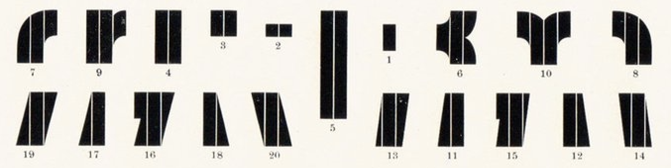
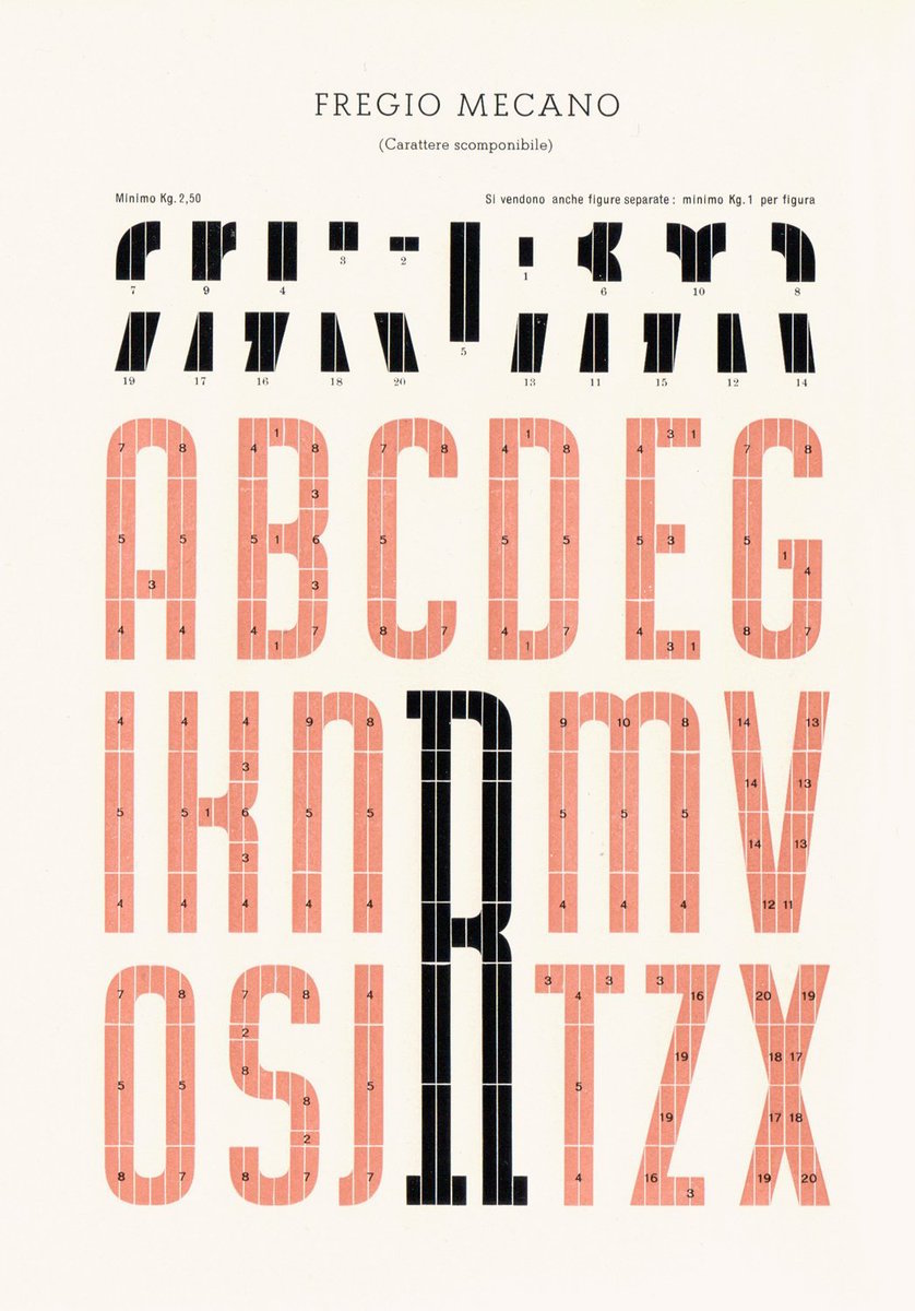
A modular typeface is an alphabet constructed out of a limited number of shapes or modules. Modular describes any letter assembled from a limited palette of distinct elements, repeated, flipped, and flopped but not scaled.
Modular letters are constructed using a limited set of distinct elements, forming a strict system with fixed modules. While many typefaces can be considered modular to some extent, adjusting traits for each character, true modular letters adhere to a defined set of modules. These elements are typically geometric and simple, such as square pixels or modernist circles, squares, and lines. However, contemporary designers are increasingly exploring more ornate forms and even incorporating physical objects into their modular letter constructions.
Historically, modular lettering emerged as a response to the limitations and possibilities of the media used to create it. Avant-garde designers in the early 20th century employed decorative and geometric elements from letterpress printing to build modular letterforms. Their work embraced the grid and reflected the modern art and architectural trends of the time. By treating letters as structural entities rather than handwritten forms, they expanded the abstract nature of the alphabet.
In the present day, designers continue to push the boundaries of modular letterforms, leveraging the potential of digital screen fonts and experimenting with more complex elements. Working within the constraints of a strict system challenges designers to manipulate predetermined elements in innovative ways. While the components of modular lettering are limited, the spirit and shapes of the letters themselves remain open to exploration and creativity.

The task of Parts Make the Whole is to design a prototype for a modular typeface by using a letter construction context. The typeface must include at all 26 characters, either in upper-case or lower-case, or a unicase. Unicase combines typical features of both cases. The letterforms should be modular, rational, and repeatable, meaning that parts of the letters are used to create other letters. The design process should begin with creating letters on a grid of squares or dots. *Handlettering or creating letters based on an existing font is not allowed; the letters must be constructed.
Any lettering or type is based on a system. Typographic systems are sets of visual rules and guidelines that govern the actions and decisions involved in creating letters. These implicit systems enable characters to work together, by regulating and defining their appearance—dictating their shapes and sizes, how they fit together, and their visual spirit, as well as all other underlying tenets of the letters.
Explore the modular system. Once defined, refine the letters to something new and less expected, the new will become the system to create all 26 letters of the alphabet. Work in Adobe Illustrator and use the software Glyphs to output the final set of upper or lower case letters as a usable, shareable, typeface.
Explore your modular system. Once you have defined your system, made some letters, and refined them to something new, the new will become your system to create all 26 letters of the alphabet. We will work in Adobe Illustrator and you will use the software Glyphs to output your final set of upper or lower case letters as a usable, shareable, typeface.
LEARNING OBJECTIVES
_ understand the anatomy of letterforms/characters/glyphs
_ explore the expressive potential of typography
_ solve communication problems within given parameters
_ methodically document relevant design inspiration and process
_ present and assess work in a visually and verbally articulate manner
_ professionally document outcomes
_ demonstrate exemplary visual craft—hand and digital
_ advance Adobe Illustrator skills (pathfinder, snap to grid, clean vectors)
_ Glyphs App (beginner level of the Glyphs program) MAC only.
SOFTWARE
Adobe Illustrator
FontStruct (free web-based software)
Glyphs app: https://glyphsapp.com/ (MAC only software)
Trial version is available for 30 days so don’t download it yet.
PC people you can use a combination of illustrator and the Glyphs app.
*The 313 Chalmers lab is open to all of you to use the the glyphs app.
PROJECT DELIVERABLES
working font (all caps or all lowercase -- not both)
process book (digital 11 x 17 landscape)
behance post
PROCESS BOOK
Process Book digital format and a pdf. It must be well organized, labeled, name on it!.
Include:
_ Your Name
_ Project Description
_ Project Overview
_ All of the process: notes from class, crits and discussions, sketches to final.
_ Final product.
**All the homework, feedback, class notes etc go into the process book. Don’t forget a title page with the name of the project and your name, project description (what was the project), project overview (your thoughts on the project), all your process (all of it! organized by date).
CALENDAR
Introduction: Wed Sept 20
The Modular Letter Lecture
Anatomy of Type.pdf
Intro to the project
Grids for sketching.pdf
Introduction to FontStruct

A modular typeface is an alphabet constructed out of a limited number of shapes or modules. Modular describes any letter assembled from a limited palette of distinct elements, repeated, flipped and flopped but not scaled. Typically these elements are geometric and simple in shape—square pixels on a digital display or modernist circles, squares, and lines.
Traditionally, modular lettering has responded to the limitations and possibilities of the media used to create it. Today designers are using more ornate, complicated and/or organic forms (modular units) and even physical objects to construct modular letters. They have taken a broader approach to modular letter-forms, pushing the possibilities to create letters from more complicated elements.
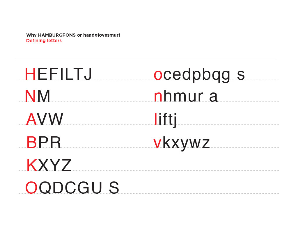
When designing fonts you always start with a few core letters, such as handgloves or hamburg and then you build out the rest of the alphabet from there. As you can note from the chart below once you have the Cap H you can get the letters E F L T, once you have the B defined you can to the P R. etc. The same principle goes with the lower case. If you start with the h you can easily get to n, u, l, i, m, r. The d gives you an idea of the p, b, q... etc.
The chart below shows once you have the Cap H you can develop the letters E F L T.
Once you have the B defined you can to the P R. etc.
The same principle goes with the lower case.
If you start with the h you can easily get to n, u, l, i, m, r.
The d give you an idea of the p, b, q... etc.
When designing a typeface always begin by figuring out the core letters. The word HANDGLOVES, handgloves or HAMBURG, hamburg gives you the core letters.
 Drawing Similar Forms: Letter Fountain
HOMEWORK
(get started in class)REFRESH + EXPLORE + CREATE
please refresh your memory and learn the parts of the letter.
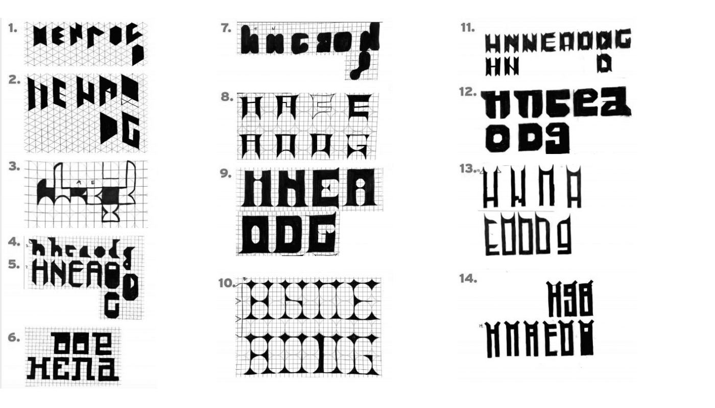
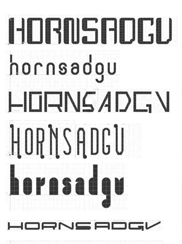
20 sets/font ideas, each set has 7 key letters H, E, N, A, O, D, G (if you are drawing caps draw them in this order -- should make sense why...
or
n, h, e, a, o, d, g (if you are drawing lowercase draw them in this order -- should make sense why...
*the a and g can be one story or 2 story try both
20 sets with 7 letters in each set. a set is a design direction.
do not draw the letter H 20 times, then 20 letter E or e.
Work in sets, the letters should go together the H should inform the E (n inform the h) get it?
Try not to fill your pages give your different ideas some space around them.
Work in different sizes/ work in different proportions.
Number your sketches and organize them sketches while you are working.
Feel free to use as many pages as necessary to maintain organization and clarity throughout your work. Begin by utilizing the provided handouts to create your initial studies. As you progress, feel empowered to design your own grids, parts, and modular elements. The key is to explore and enoy the process, ensuring that it remains an enjoyable experience rather than a daunting one. Remember, even if the results may initially appear unattractive, embracing the unconventional can lead to interesting outcomes. Your primary objective is to create/explore. The only restriction is that you cannot hand-letter the letterforms or draw them by hand. Instead, you must construct all letters using a predefined set of parts. *Make sure you know what this means before you start your homework.
You have the flexibility to complete all 20 studies by hand, with each study consisting of 7 letters. Alternatively, you can choose to complete 10 studies by hand and 10 studies using Fonstruct. If you decide to use Fonstruct, remember to save and showcase your work. However, if you don't enjoy using Fonstruct, feel free to focus solely on the hand-drawn studies. You are required to create 10 distinct fonts for your homework, and the remaining fonts can be hand-drawn.
Remember to explore and have fun with the process. It should be an enjoyable experience, not a tedious one. Don’t limit yourself to constructing only capital letters or only lowercase letters. H, E, N, A, O, D, G, /or/ n, h, e, a, o, d, g.
For the class presentation, please bring all your work in physical form. Print everything so that everyone can see what you have created. If you encounter difficulties printing from FontStruct, you can take a screenshot and print that instead.
While working, take some time to review your sketches and ens
ure they are well-organized. If they are scattered or disorganized, consider cutting them out from their original pages and tape them onto another sheet of paper for better organization. If you used tracing paper, you may find it helpful to follow the same approach.
As you examine your sketches mark the ones that you particularly like or find interesting. You may realize that you rushed through some of them or that several look similar. In such cases, take a moment to reflect on your work and sketch a few more ideas. It’s important to have a diverse range of choices to explore.
To Get StartedSketch as neatly as you can. Keep organized. Range of solutions is better than tring to get on idea perfect. You have time to make something perfect in the next rounds of exploration. Now is the time to explore options. Explore both uppercase and lowercase options. Try constructing all uppercase letters: H, E, N, A, O, D, G. Try all lowercase letters: n, h, e, a, o, d, g. Construct the letters using a defined set of modular forms or parts. Use as many or as few shapes as necessary, but avoid scaling or distorting them. Do not overlap elements or use white shapes cut out from black forms. Note that smaller grids offer fewer design options.
![]()
Write down the checklist and keep it in front of you.
The main rule is the letters must be constructed = based on some set of modular forms.
__ alll caps : H, E, N, A, D, O, G.
__ all lowercase: n, h, e, a, o, d, g
__ unicase
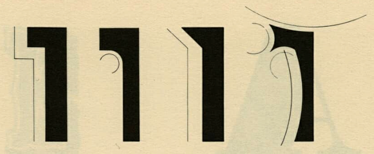
__ try sans serif
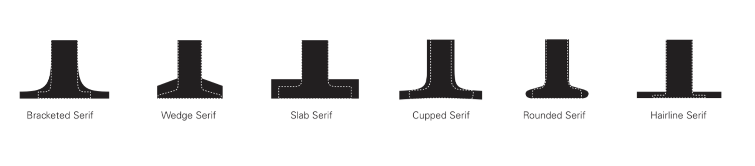
__ try serifs
__ try different types of serifs
__ try to work in different sizes: more grid units
__ tall (condensed), thin stroke / __ short (extended), thin stroke
__ tall (condensed), bold stroke / __ short (extended), bold stroke
__ tall (condensed), super heavy / __ short (extended), super heavy
Diagram by Rob Roy Kelly, America Wood Type
![]()
sketching examples
![]()
![]()
*if you have trouble printing out of FontStruct take a screen shot and print it.
![]()
What is due on MONDAY
— 20 sets of the 7 letters, nice variety and neatly organized
— Sketches printed out and ready to talk about.
— Favorite 5 marked in some way.
Take risks: Embrace experimentation and step outside your comfort zone to discover innovative and unexpected solutions.
please refresh your memory and learn the parts of the letter.
20 sets/font ideas, each set has 7 key letters H, E, N, A, O, D, G (if you are drawing caps draw them in this order -- should make sense why...
or
n, h, e, a, o, d, g (if you are drawing lowercase draw them in this order -- should make sense why...
*the a and g can be one story or 2 story try both
20 sets with 7 letters in each set. a set is a design direction.
do not draw the letter H 20 times, then 20 letter E or e.
Work in sets, the letters should go together the H should inform the E (n inform the h) get it?
Try not to fill your pages give your different ideas some space around them.
Work in different sizes/ work in different proportions.
Number your sketches and organize them sketches while you are working.
Feel free to use as many pages as necessary to maintain organization and clarity throughout your work. Begin by utilizing the provided handouts to create your initial studies. As you progress, feel empowered to design your own grids, parts, and modular elements. The key is to explore and enoy the process, ensuring that it remains an enjoyable experience rather than a daunting one. Remember, even if the results may initially appear unattractive, embracing the unconventional can lead to interesting outcomes. Your primary objective is to create/explore. The only restriction is that you cannot hand-letter the letterforms or draw them by hand. Instead, you must construct all letters using a predefined set of parts. *Make sure you know what this means before you start your homework.
You have the flexibility to complete all 20 studies by hand, with each study consisting of 7 letters. Alternatively, you can choose to complete 10 studies by hand and 10 studies using Fonstruct. If you decide to use Fonstruct, remember to save and showcase your work. However, if you don't enjoy using Fonstruct, feel free to focus solely on the hand-drawn studies. You are required to create 10 distinct fonts for your homework, and the remaining fonts can be hand-drawn.
Remember to explore and have fun with the process. It should be an enjoyable experience, not a tedious one. Don’t limit yourself to constructing only capital letters or only lowercase letters. H, E, N, A, O, D, G, /or/ n, h, e, a, o, d, g.
For the class presentation, please bring all your work in physical form. Print everything so that everyone can see what you have created. If you encounter difficulties printing from FontStruct, you can take a screenshot and print that instead.
While working, take some time to review your sketches and ens
ure they are well-organized. If they are scattered or disorganized, consider cutting them out from their original pages and tape them onto another sheet of paper for better organization. If you used tracing paper, you may find it helpful to follow the same approach.
As you examine your sketches mark the ones that you particularly like or find interesting. You may realize that you rushed through some of them or that several look similar. In such cases, take a moment to reflect on your work and sketch a few more ideas. It’s important to have a diverse range of choices to explore.
To Get StartedSketch as neatly as you can. Keep organized. Range of solutions is better than tring to get on idea perfect. You have time to make something perfect in the next rounds of exploration. Now is the time to explore options. Explore both uppercase and lowercase options. Try constructing all uppercase letters: H, E, N, A, O, D, G. Try all lowercase letters: n, h, e, a, o, d, g. Construct the letters using a defined set of modular forms or parts. Use as many or as few shapes as necessary, but avoid scaling or distorting them. Do not overlap elements or use white shapes cut out from black forms. Note that smaller grids offer fewer design options.
Write down the checklist and keep it in front of you.
The main rule is the letters must be constructed = based on some set of modular forms.
__ alll caps : H, E, N, A, D, O, G.
__ all lowercase: n, h, e, a, o, d, g
__ unicase
__ try sans serif
__ try serifs
__ try different types of serifs
__ try to work in different sizes: more grid units
__ tall (condensed), thin stroke / __ short (extended), thin stroke
__ tall (condensed), bold stroke / __ short (extended), bold stroke
__ tall (condensed), super heavy / __ short (extended), super heavy
Diagram by Rob Roy Kelly, America Wood Type
sketching examples
Introduction to FontStruct
*if you have trouble printing out of FontStruct take a screen shot and print it.
What is due on MONDAY
— 20 sets of the 7 letters, nice variety and neatly organized
— Sketches printed out and ready to talk about.
— Favorite 5 marked in some way.
Take risks: Embrace experimentation and step outside your comfort zone to discover innovative and unexpected solutions.