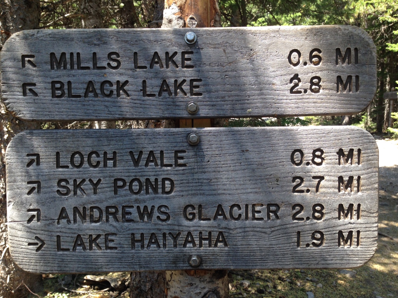
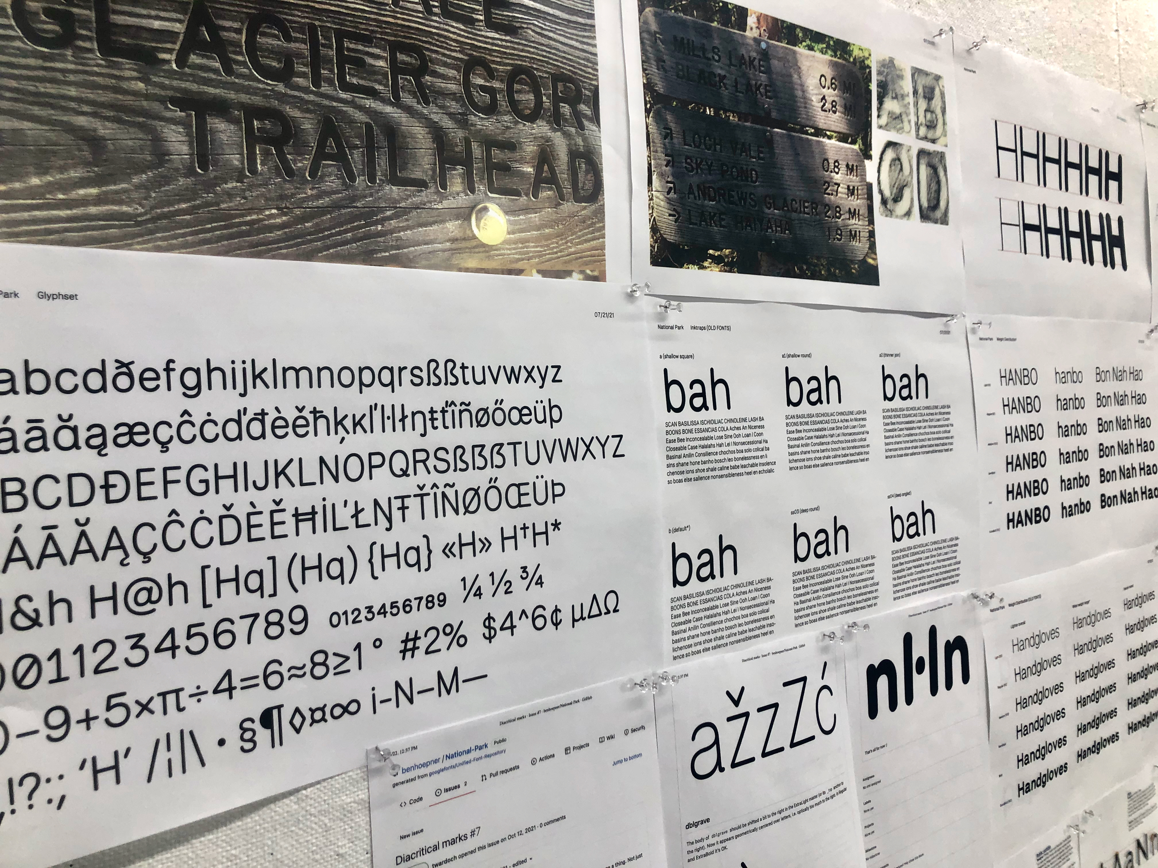
The letterforms found on the wooden signage at the Rocky Mountain National Park inspired the creation of the National Park Typeface
The letters on these wooden trail and directional signs are a system of paths, points, and curves that a router follows. The router’s "bit" follows the path and gives the letters its stroke weight or thickness when engraving a sign. Our National Park Typeface walks along the path of both honoring the quirky nature of the forms being created by a router bit and optimizing the forms to work in a variety of sizes and languages for print, web, and mobile platforms.
 The router’s "bit" follows the path and gives the letter its stroke weight or thickness only when engraving a sign.
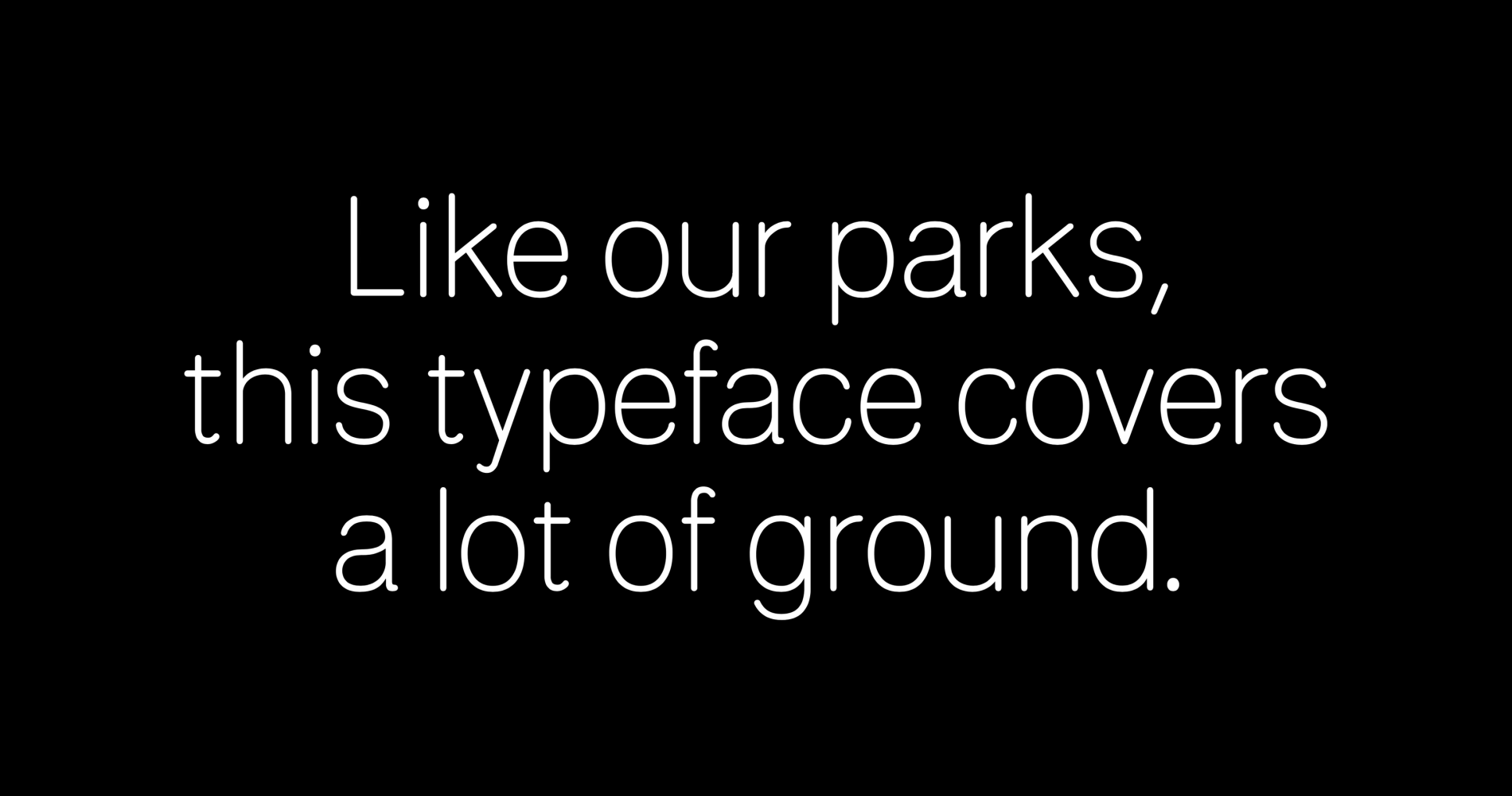
“Digitizing this charming router-carved type of US National Parks and designing National Park is our way to document, archive, and celebrate this lettering while making it accessible for all to use.” – Jeremy Shellhorn
Professors Jeremy Shellhorn and Andrea Herstowski with students Chloe Hubler and Jenny O’Grady to publish the first version of the National Park typeface in 2018︎︎︎. National Park was downloaded in over 180 countries and featured in Fast Company where it caught the eye of Dave Crossland Lead UX Programmes & Operations, Google Fonts.
 animations by Ben Hoepner
“When Dave reached out to us we loved the idea of updating and expanding National Park and getting out to a larger audience.” – Andrea Herstowski. Starting in 2021, National Park was completely redrawn, honoring the router while taking into account a bit more usability across media. It has an expanded character set to work in multiple languages, is a Variable Font, and this update includes a Stencil. National Park 2022, Google Font version was produced by Associate Professor Andrea Herstowski and KU student Ben Hoepner (now KU graduate).
“It was important to everyone involved that we have a student involved in the project. Ben was an integrable part of the project and instrumental in every phase of the design, digitizing, and getting the 2022 version in-line with the Google standards.” – Andrea Herstowski
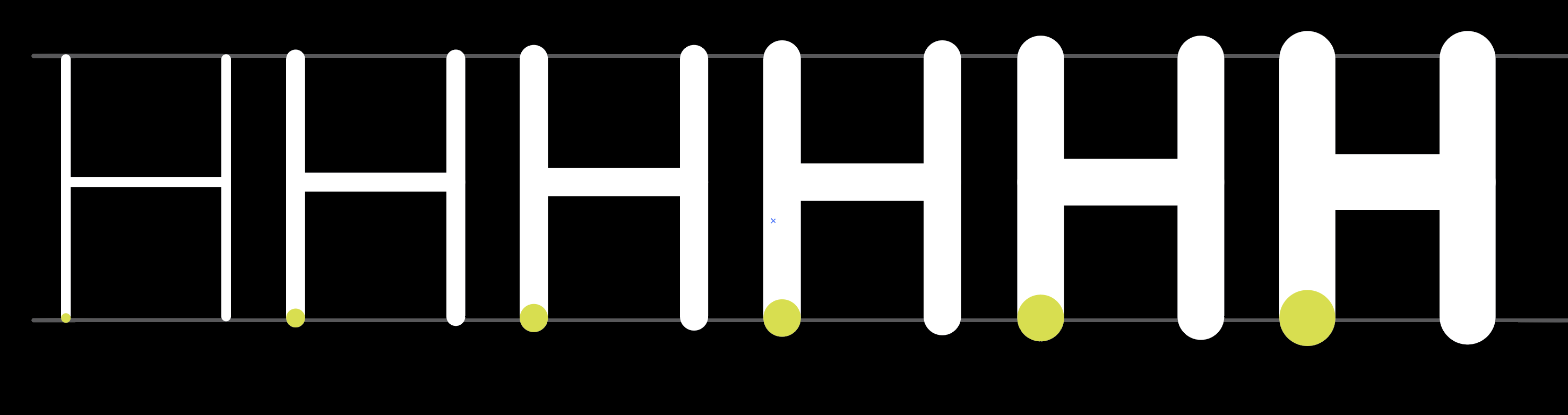
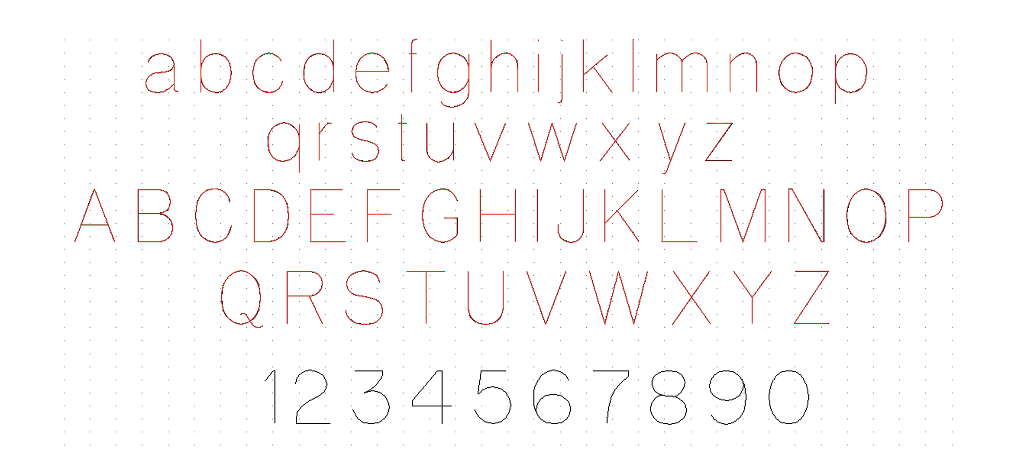
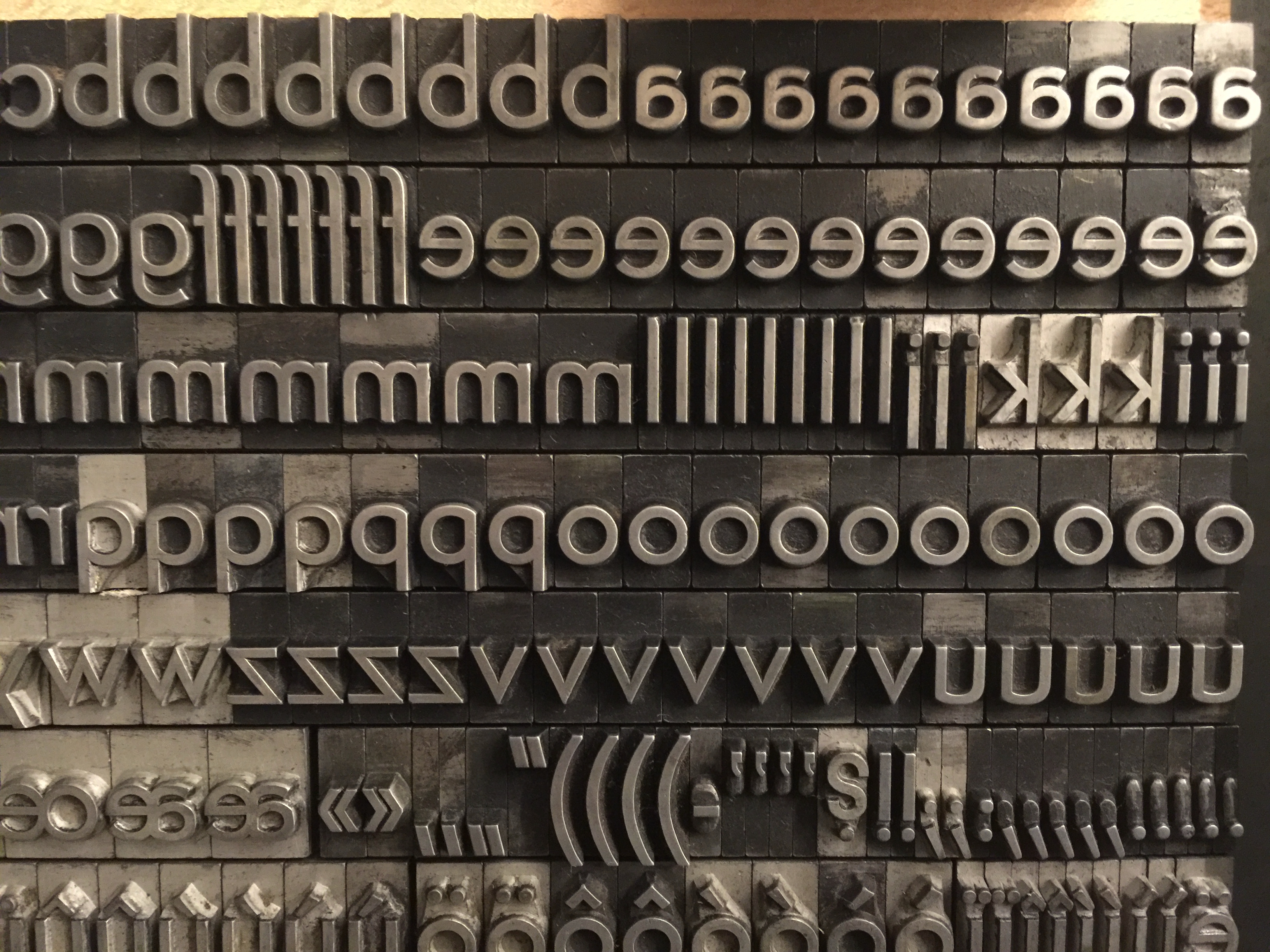
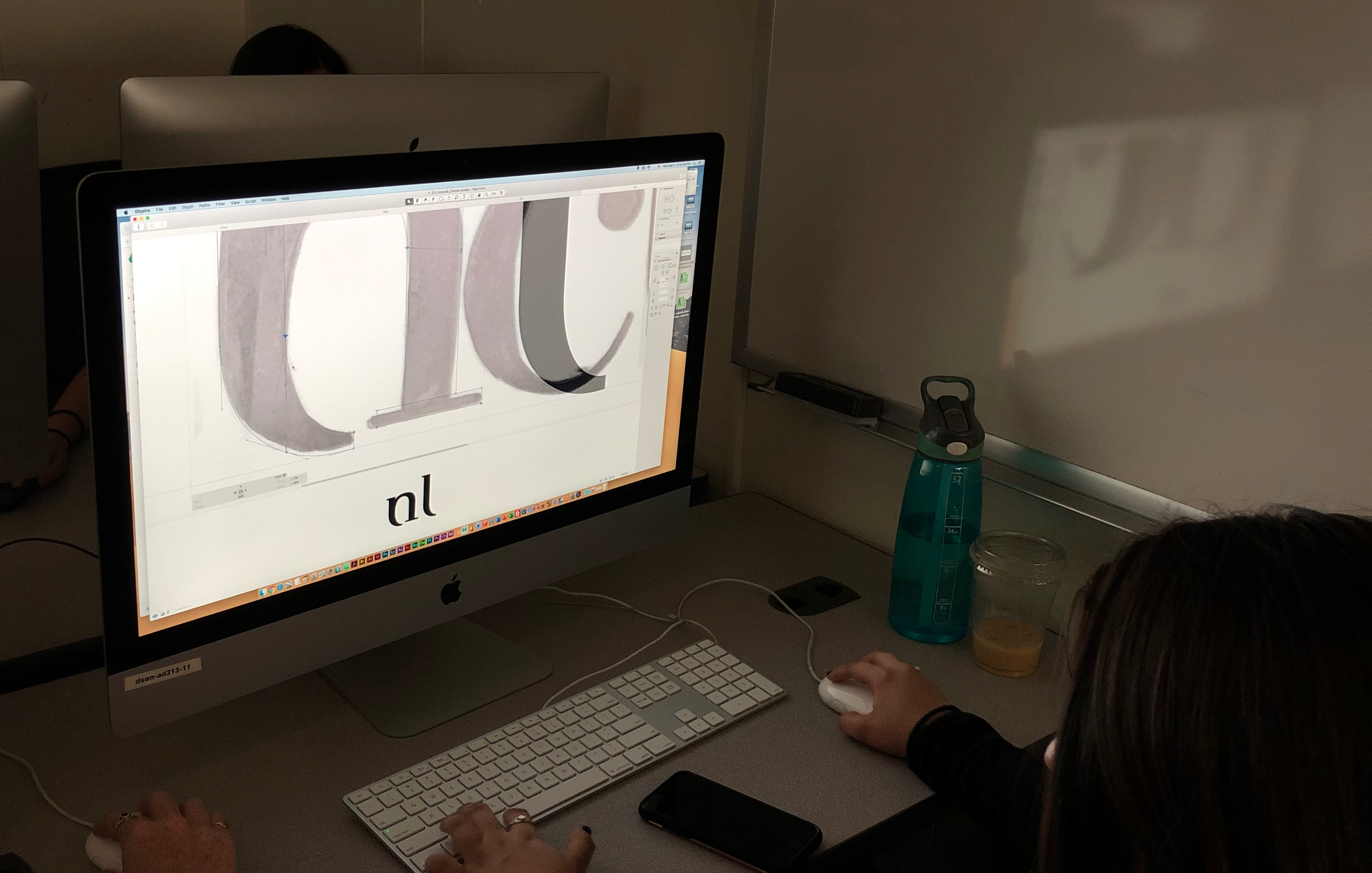
Each character’s design begins with a vector skeleton, (or series of coordinates) that a router would typically interpret and then carve into a wooden sign. We found out quickly that if you use a larger router bit to make a bolder letter it grows past the cap line, past the baseline and the letter’s porportion becomes narrrower.
From there, we adjust each skeleton to be comfortably legible at each weight, and finally apply optical adjustments where an analog router can’t.
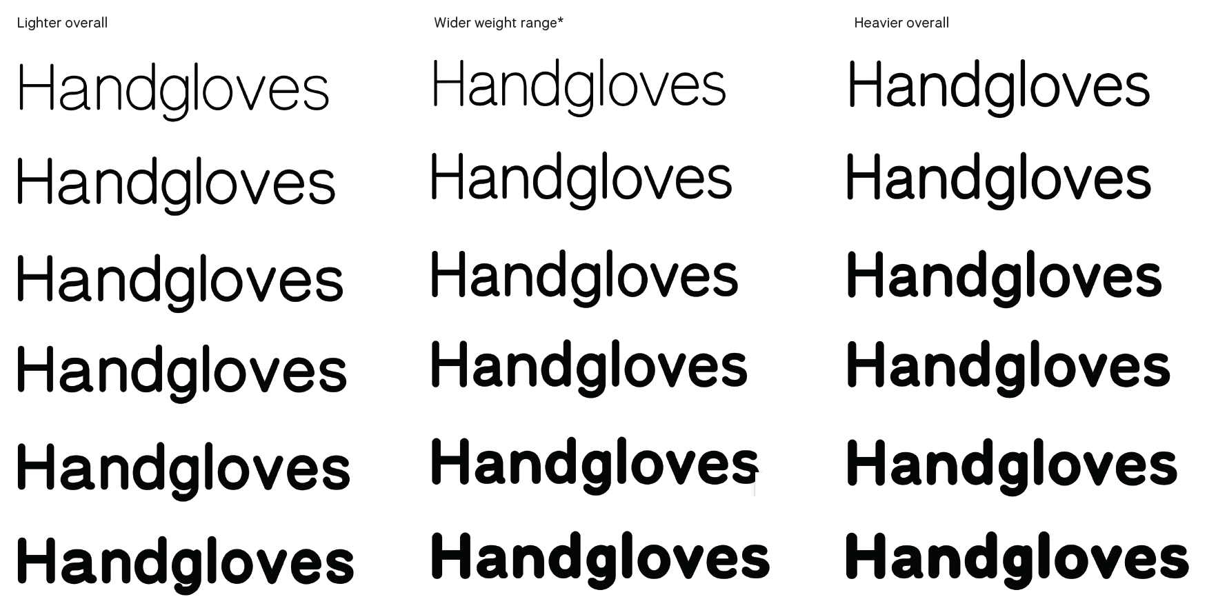
The result is a typeface that suits a variety of uses at different sizes while staying true to much of the unique character and warmth of its inspiration.

When honoring the router bit form how far can optical compensation go before losing its original form?

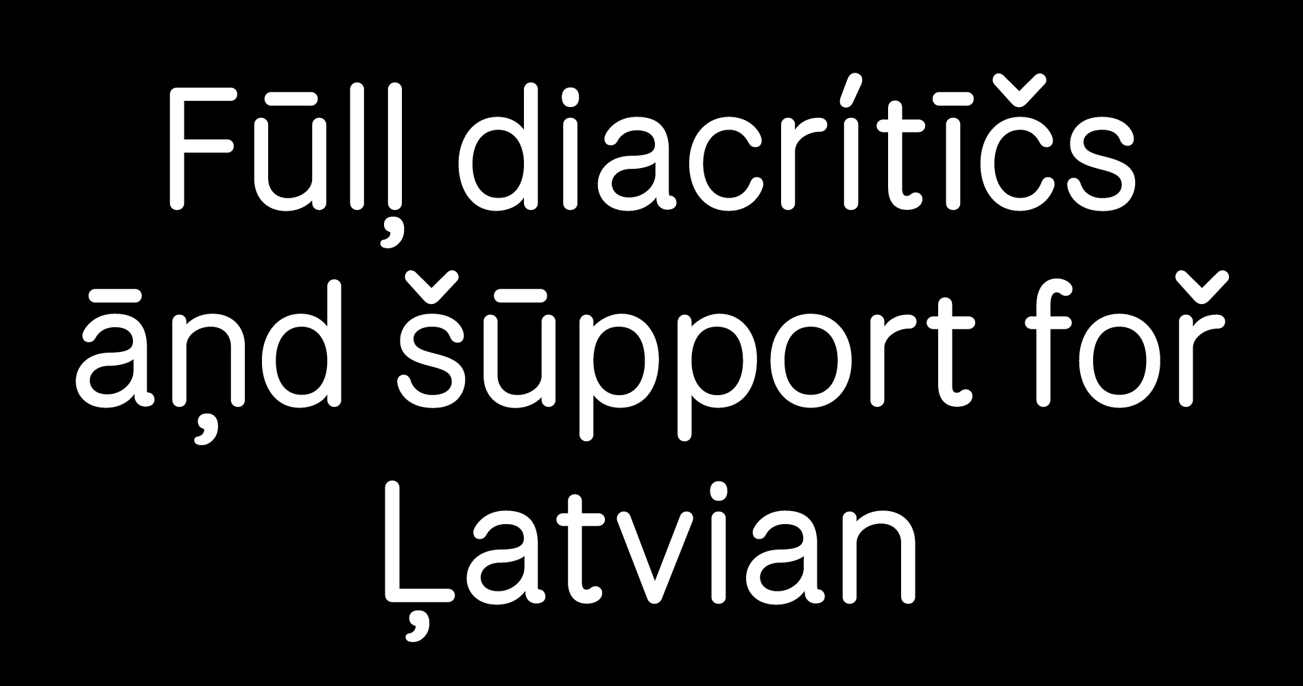
Getting feedback from diacritic experts was key in making National Park usable in multiple languges.
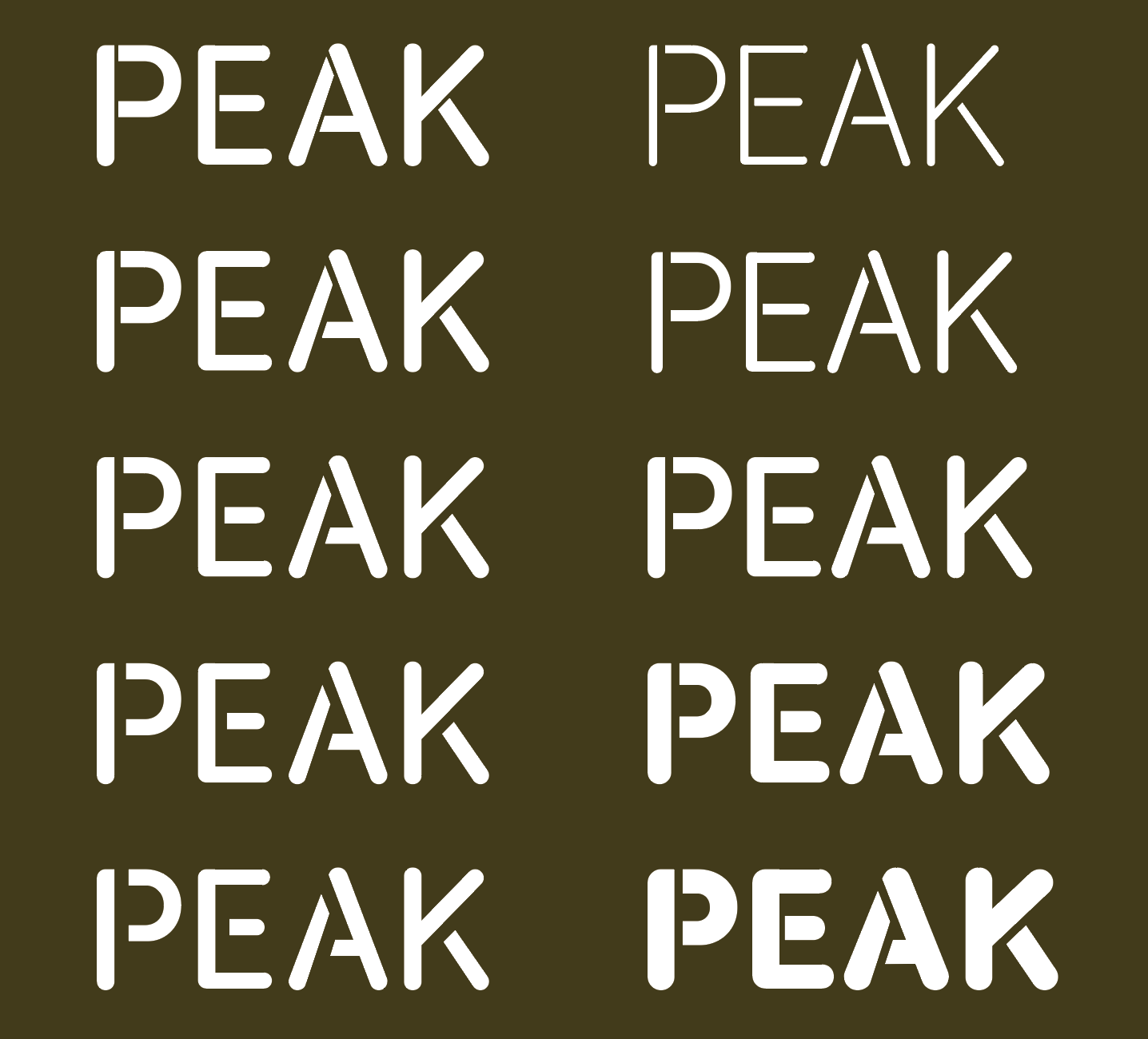
Exploring Stencil options. Left the weight stays the same and the gap is a variable option. Right is a variable font all weights have a stencil version.
2022 microsite︎︎︎ designed by professor Jeremy Shellhorn and Ben Hoepner.
You can also find it in the Google Font Library︎︎︎.
Thank you Dave Crossland, Adam, Yanone, Viviana, Kalapi, Felipe for their support, feedback, keeping our minds on the big picture, and our eyes tuned to the details.
Variable font family commissioned by Google Fonts meant to capture and improve upon the charming router-carved type of US National Parks. Microsite︎︎︎:: Google Fonts︎︎︎
Semplicita
In-progress.
Tipoteca Italiana Fondazione in Cornuda, Italy. Working with Tipoteca Director Sandro Berra on the digitization of a selection of wood type.
A series of P5.js experiments exploring the intersection between typography and code. Generative Typography. Type@Cooper. 2020
A series of studies using Drawbot / Python. Python for Visual Designers
Type@Cooper 2022
Type@Cooper 2022
Python Script
Python script for the Glyphs app. Run it to capture all the sticky notes into one text file.

Typographic Univers gives the design student an introduction to the world of type design. Designing type systematically with a focus on looking at, defining, and refining the interrelationships between forms.