The Rationalization of the Letter
Understanding the Proportions of letterforms is a key component in type design. ‘Relationship’ is the most important word in type design. A typeface is a system governed by the relationships between characters, creating a coherent set of glyphs.
— R. Hunter MiddletonOBJECTIVES
Create an original set of constructed, serifed, varied stroke width capital letters HANDGLOVESMUI
understand the history of the Roman du Roi
understand the extrema, points and handles, how to draw and correct in Glyphs
expanding your drawing skills in Glyphs
understand how font design is a system - similarities and differences between characters.
understand how to use and edit components
understand corner components
understand and construct overshoots
understand optical compensation both in round letterforms and diagonals
understand cap height vs ascender height
understand the principles of spacing
understand how to create a variable font
understand how to create a contextual alternate
RESOURCES
Sketching Techniques
Drawing Vectors
Construction
Spacing
More grids if you need
Flikr: Lettering Manuals
Riccardo Olocco lecture.pdf
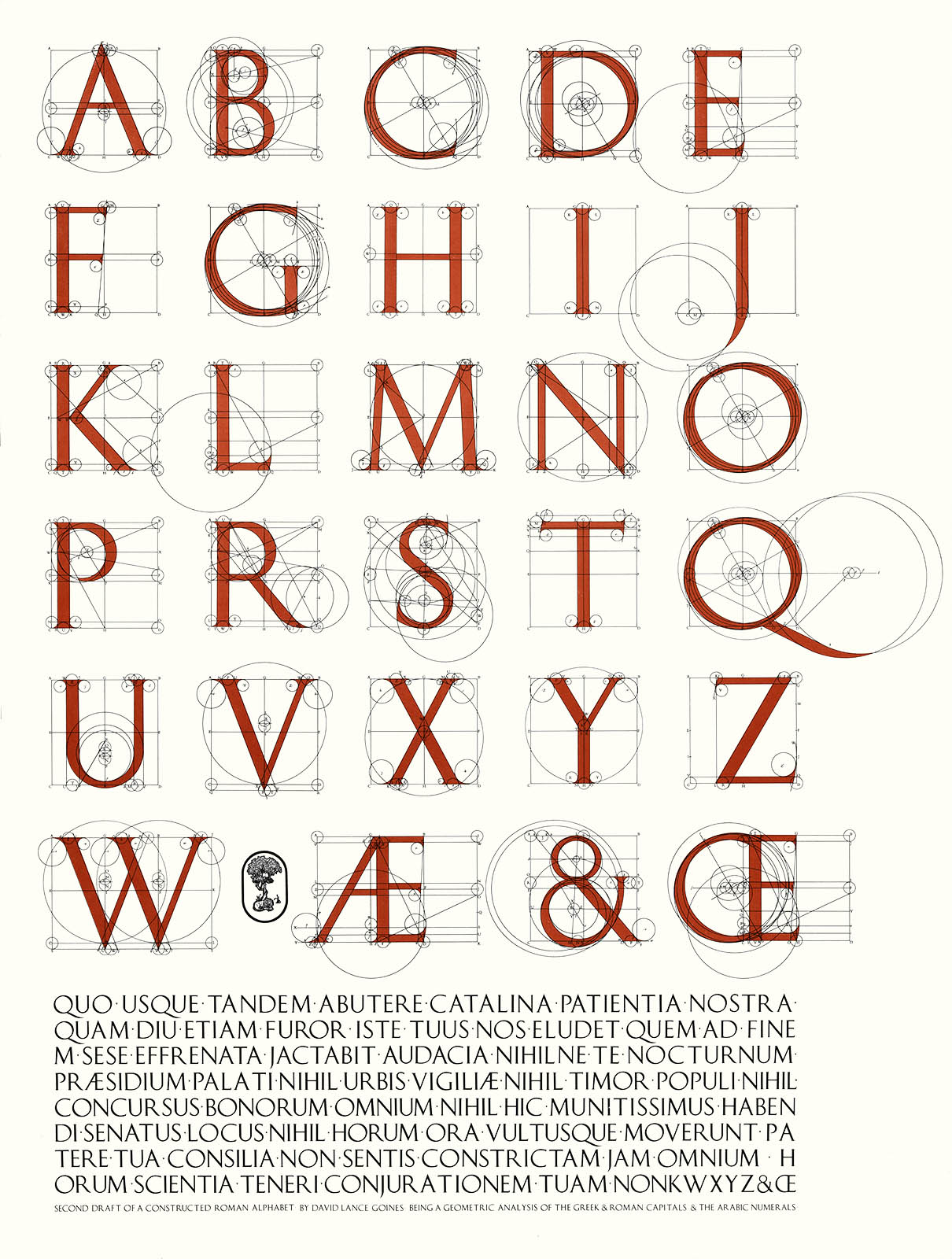
David Lance Goines’ A Constructed Roman Alphabet.
Digital version
Champ Fleury: Library of Congress
Alphabetum Romanum Codex Vaticanus
(orginal) available as a facimile
Of the Just Shaping of Letters download.pdf
The Mathematical Quest...The Quest for the Perfect Letter.pdf
CALENDAR
Introduction

Romain du Roi
In 1694, King Louis XIV of France commissioned his own typeface for use by the Imprimerie Royale. It was so named "Roman of the King" or "Romain du Roi". The type was first used in 1702.The Romain du Roi stands as a landmark of typography in the Age of Enlightenment. The Enlightenment, also known as the Age of Reason, was a philosophical movement that took place primarily in Europe and, later, in North America, during the late 17th and early 18th century. Its participants thought they were illuminating human intellect and culture after the "dark" Middle Ages.
Romain du Roi is constructed on a square divided into a grid 8 units subdivided into 36 smaller units.
The conception of the letterforms reflects a difference in attitude from the prevailing roman typefaces before it. Whereas previous roman typefaces developed naturally over time, evolving in the hands of punch cutters from the typefaces of the fifteenth century, the Romain du Roi was the result of rational design: the letterforms were mapped on grids before being cut into metal.
The Romain du Roi was not the first “constructed alphabet”, Felice Feliciano, Geoffroy Tory and Albtecht Dürer studied the letterforms about 300 years before Romain du Roi. As early as 1463, Felice Feliciano (italian) geometrically recreated the alphabet of roman inscriptions and published as Alphabetum Romanum Codex Vaticanus 6852. In 1529, in his Champ Fleury, Geoffroy Tory (french) mapped letterforms on grids and showed their construction. And somewhere between 1471 – 1528 Albtecht Dürer (german) created On the Shaping of Letters.
In 1925 Herbert Bayer, the father of Bauhaus typography designed the Universal Alphabet. San Serif constructed alphabet: simple and pure. It also is associated with the Machine Age.
Thursday, Jan 29
Refresher: Font Classifications
Letterfountian: drawing to font
Type Mechanics part 1 | part 2
Lecture: Capital Letter
In-class do the Capital proportional studies | ai | (build reference pdf in class)
Try at least one old-style typeface and then pick one of your favorite typefaces to study
upload a pdf of your study on the google drive so everyone can reference it.
Please refer to the proportion of the letters: use https://www.letterfountain.com/drawingtofont.html
Designing Type as a reference for proportion and construction of each letter
Construct different kinds of serifs so you are comfortable with serifs.
Please look over: Type Mechanics, Tobias Frere-Jones part 1 | part 2
Watch: Monotype Vairable
HOMEWORK
Variable Type demo
Based on what we discussed in class. Be prepared to show this in your process (ie do it and take an photo of it)
Then Construct 7 capital letters :: HOENDVM(or A) (inside part of the M is the V -ish)
1) contrast in the stroke (avoide mono-weight)
2) serifed letterforms, using your defined construction/rules
3) pay attention to proportion (not all letters should be the same character width.
4) optional when sketching if you want to think of at least the HONE becoming a variable we can test ti
Work by only hand, not on the computer.
Start with the H.
Please try each set's different height, weight, and character width.
Work at least 1 inch tall
If you work in pencil make sure you fill in your letters so we can see them from afar. Start with the H and move through the other letters in any order you wish.
* Pay attention to proportion (exercise we did in class)
* Capital letters only.
* Try to add weight to your letters, not just mono-line (see sketching techniques).
* Must be constructed.
* Must have some sort of serif.
Please look over: Type Mechanics, Tobias Frere-Jones part 1 | part 2
Watch: Monotype Vairable
For the next class you should have 3 or more different sets of 7 letters. HOENDVM(or A) (it may take your time to figure out your system so you should have some misses before you come up with a direction). Looking for a range of solutions. Each set should fit on 8.5x11. Bring in originals, and place a scan of your sets into your Scans folder on the google drive.
^do as many sketches as it takes to find a direction you want to do. remember this is an exercise.
Tuesday, Feb 3
HOMEWORK
Type Mechanics part 1 | part 2
Stroke Optics: the art of eyeballing
Optical Compensation: Lynne Yun
Pick a set to move forward with...
Read: Type Mechanics, Tobias Frere-Jones part 1 | part 2
Read: Stroke Opitics: scannerlicker.net / eyeballing-iv-the-stroke-optics
Watch: Optical Compensation: https://www.youtube.com/watch?v=NSwEe-vMfP4
Refine your proportions.
Define your stroke weights.
In Glyphs
Define your stem width
Define your bowl width it should be a bit wider than the stem (the thickest part of the round)
Explore Different Serifs
Define and refine your serifs
Build the H
Building a serif and make it a component
Use the default overshoot for you O
Things to think about/ practice...
Review extrema, points and handles, how to draw and correct in Glyphs
Review similarities and differences between characters.
Create components
Understand and set overshoots
Understand optical compensation both in round letterforms and diagonals
Understand cap height vs ascender height
Understand the principles of spacing start with HOHOOH
Watch if you are interested and haven’t yet Monotype Helvetica Now
Thursday, Feb 5
watch open type video
create alternate character
Crit HOMENVD
Watch: How to use Open Type Features in Illustrator
https://www.youtube.com/watch?v=8QAZc3itnN0
Create a custom ligature or alternate character so we can get it working next class.
HOMEWORK
add I U G L A S
refine letters
checklist
check extrema, points, handles
use components
check overshoots
create optical compensation
spacing
create final presentation
Add I U G L A S
Refine and finalize -> HANDGLOVESMUI
Check extrema, points and handles
Check similarities and differences between characters.
Use components
Check overshoots
Refine optical compensation both in round letterforms and diagonals
Refine spacing
DUE next class
Tuesday, Feb 10
* or have done by Thursday.
Make folder on the google drive. Use this folder/file structure for every project.
Folder: Your name: Project Name inside that folder a
__ Folder: Scans with your Scans/Sketches, (shows process)
*** include the proportion sheet you made in Illustrator, save as a pdf!
__ Folder: Glyphs with your glyphs app file and the .otf file
__ Presentation pdf
__ Instagram image(s)
__ Project Overview (google doc or word) your review of the project
Meet at the Spencer Research Library.