Andrea Herstowski
aherstowski@ku.edu
office hours by appointment
Class Syllabus
Resources
Google Drive
The Ampersand
The ampersand (&) is a symbol that represents the word “and.” It is derived from the Latin word “et,” which means “and.” The ampersand dates back to ancient Rome. It was first used by the Roman scribes in the 1st century A.D. as a way to abbreviate the word “et.” This was done by combining the letters “e” and “t” into a single character. The ampersand was originally written as a ligature, a combination of two or more letters written as a single symbol. (lecture)
The ampersand was widely used by the Romans and continued to be used for many centuries after the fall of the Roman Empire. In the 18th century, the ampersand became more widely used in English.
We know the origin of the symbol Et but where did the word “ampersand” come from? The word "ampersand" is a shortened form of the phrase "and per se and," which means "and by itself." It is believed the word "ampersand" was coined by schoolchildren. It was common practice to add the “&” sign at the end of the alphabet as if it were the 27th letter, pronounced as the Latin et or later in English as and. As a result, the recitation of the alphabet would end in “X, Y, Z, and per se and”. This last phrase was routinely slurred to “ampersand”. The term "ampersand" had entered common English usage by 1837. explained
CALENDAR
Introduction
Lecture

The invention of the ampersand is usually credited to Marcus Tullius Tiro, who was the faithful slave and secretary to the Roman lawyer and politician Cicero. Tiro invented a shorthand writing system in 63 B.C. called Tironian Notes, which included the ampersand.
Jan Tschichold (1902 – 1974) was particularly interested in the design of the ampersand, which he believed was an often overlooked symbol in typography. In his book "The Form of the Book," Tschichold argued that the ampersand should be designed with the same care and attention as the other letters of the alphabet. He believed that the ampersand should be treated as a unique and distinctive symbol. Tschichold devoted an entire study to the development of the ampersand in his 1953 booklet “The Ampersand: Its Origin and Development,” where he collected hundreds of ampersands to chronicle the character’s evolution from 1st century Pompeiian graffiti, through medieval manuscripts, and finally to 19th century printed forms.
Tschichold’s ideas about the ampersand and its role in typography have had a lasting impact on the field, and his ideas continue to be influential to this day. Many modern typefaces feature expressive and stylized ampersand designs, reflecting Tschichold's belief in the importance of this often-overlooked symbol.

There are two basic forms of the ampersand, with many variations of both: the traditional, classic double counter version (&), and the style that looks more like an E or an et, sometimes with the addition of curves and flourishes. It is common for an upright, Roman typeface version to have the first style, with its companion italics switching to the second, more calligraphic version. Most fonts have just one ampersand, but with the expanded character set of the OpenType font format, some contain two or more versions, occasionally including a small cap ampersand that is designed to match their shorter height.
Jonathan Hoefler, the founder of the Hoefler & Co. type foundry, is known for his love of the ampersand symbol (&). Hoefler has said that the ampersand, which is used to represent the word "and," is a "lovely little glyph" and a "perfect example of the power of typography." He describes the ampersand as a "visual bridge" that connects letters and words and has praised its versatility as a design element. Hoefler & Co. has produced a number of popular typefaces that feature prominent ampersands, including Hoefler Text and Sentinel.
Intro and workday
Watch: sketching out of the confort zone
Sketching visual explanations: Sketching Techniques: double pencil
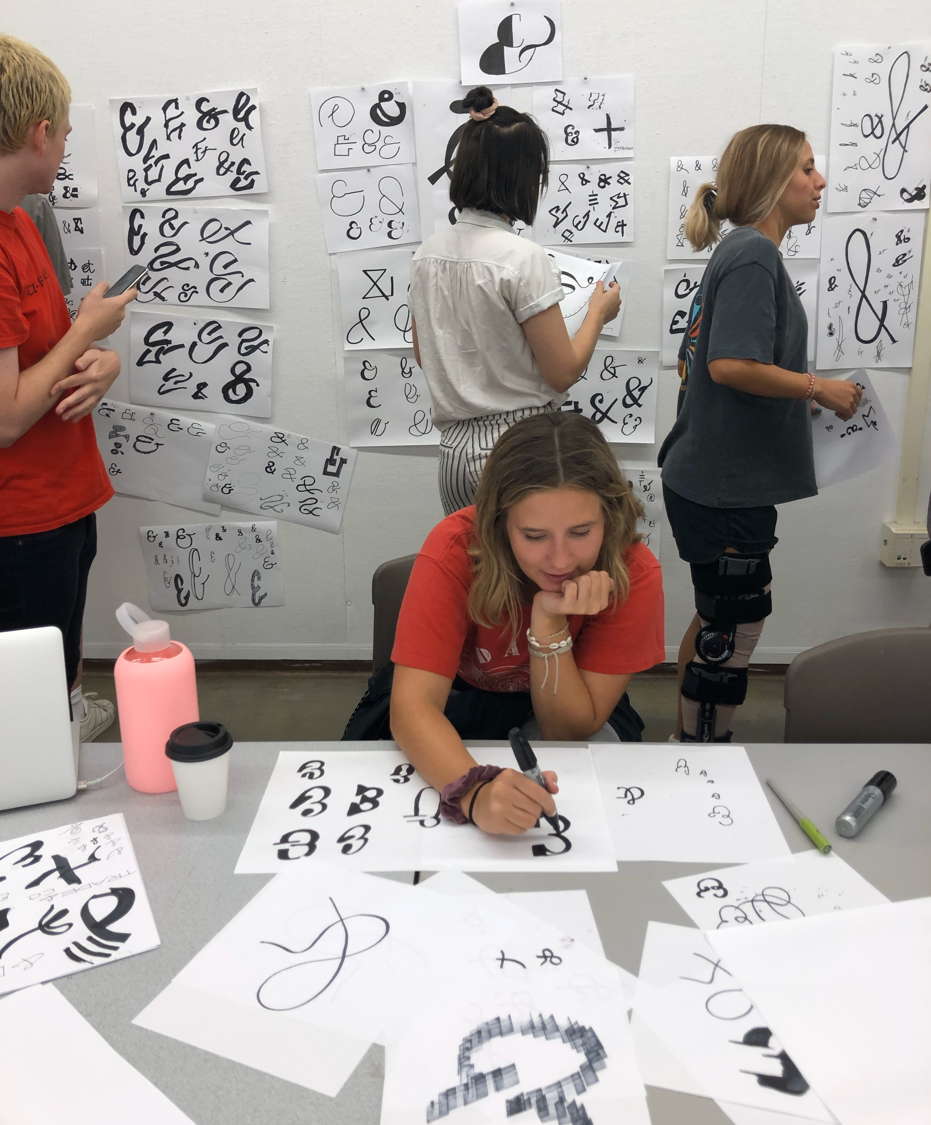
EXPLORE! make make make. Here is a guide.
When you have exhausted your making.
![]()
Sketch more if you need/want.
Pick your favorite 3 ampersands (yes any of them).
Look at adding weight to them if they are monoline.
Digitize/Draw the 3 in the same Glyphs file (-- just use ABC or 123)

