level
beginning typography
no. of class periods
5
Final Presntations
Anne C
Mollie M
Kiran
Elia H
LINKS & PDF
Letterform Combinations
Letter Form & Construction
Design Exloration Example
WATCH
How to Present Logo Create Instagram Sticker Animated Gif Tips
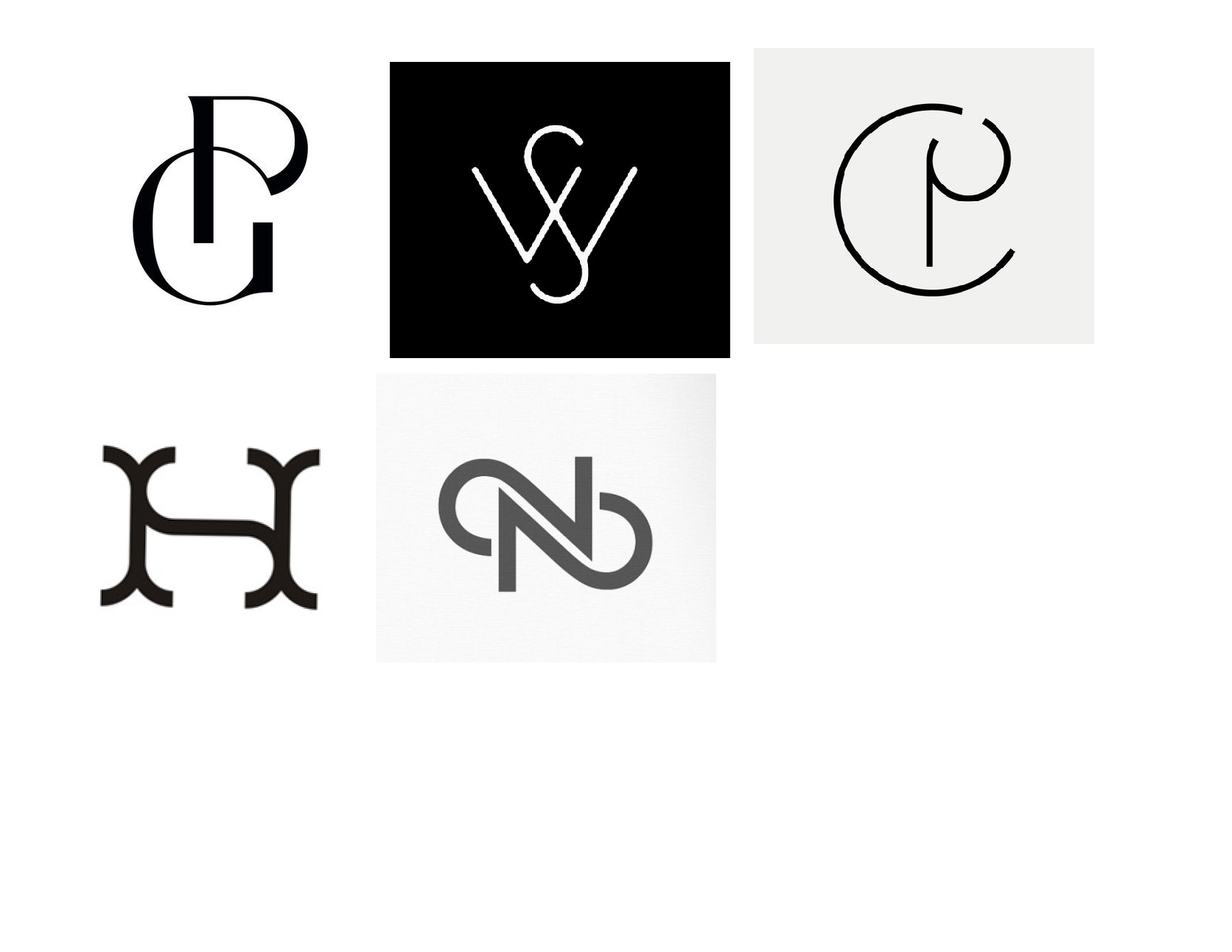
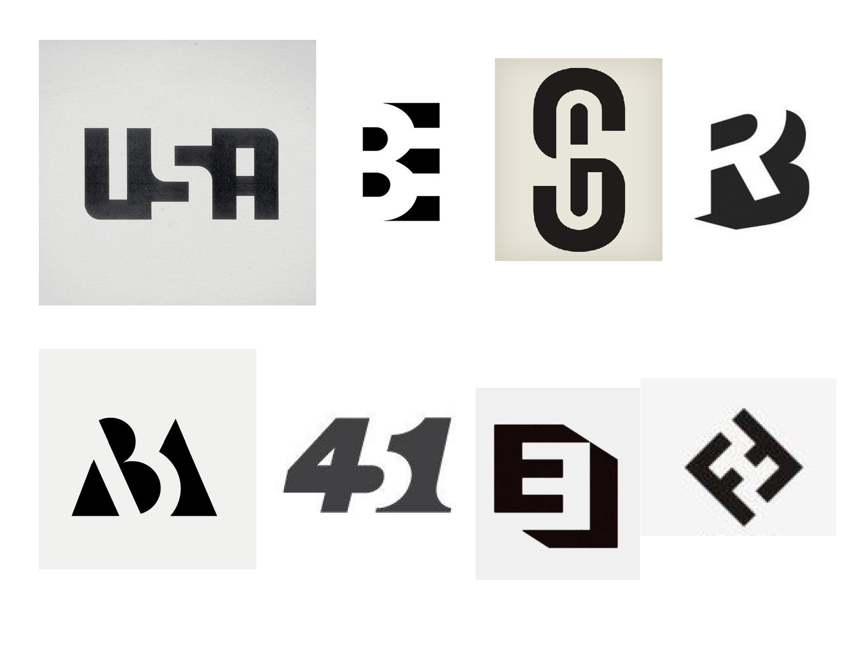
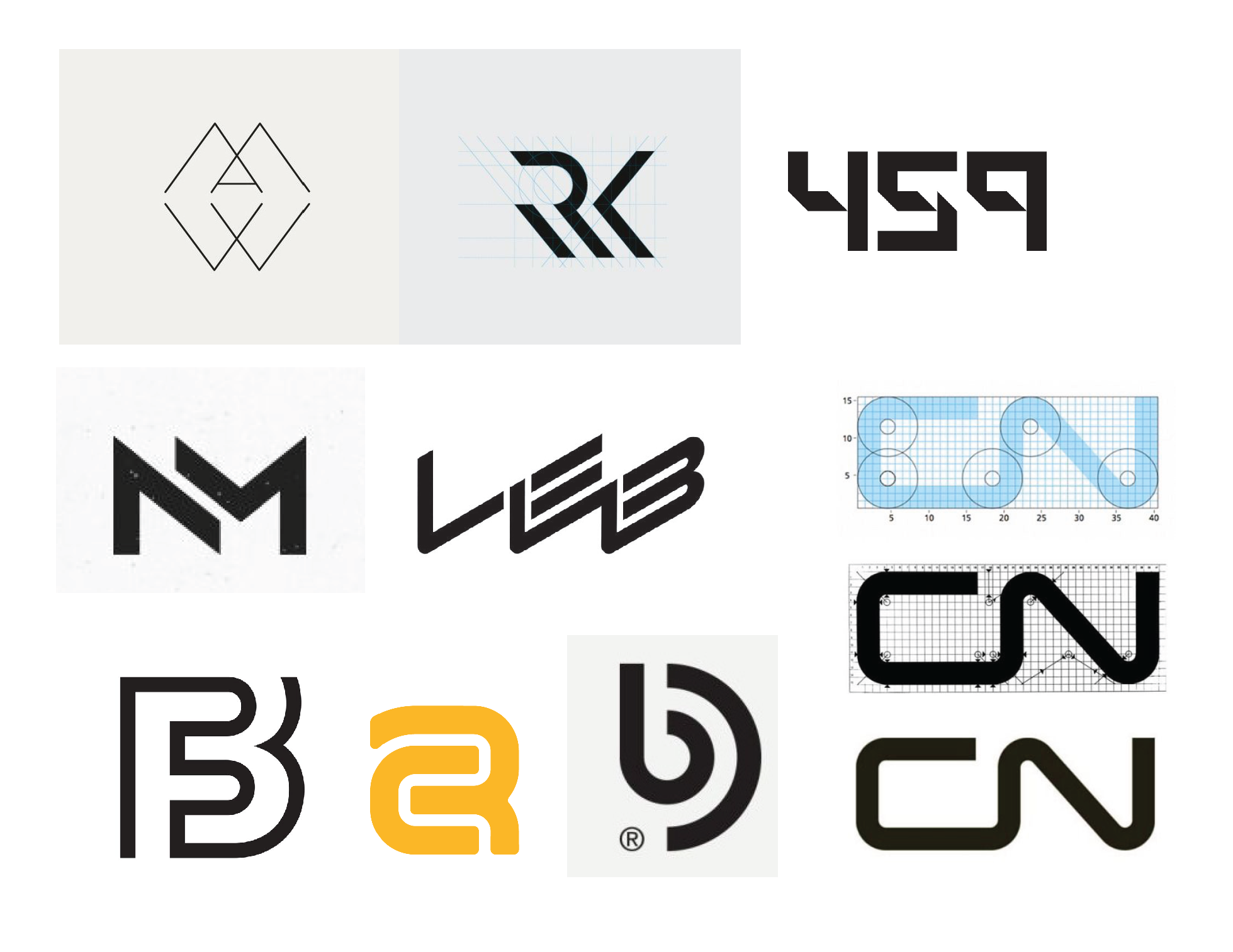
Personal Monogram
Creating a customized typographic monogram | sophomore year
Create a compelling customized logotype using the initials of your name (2 or 3 letters). The logomark must work on its own, work large, small, in print, on screen and and locked up with your name.
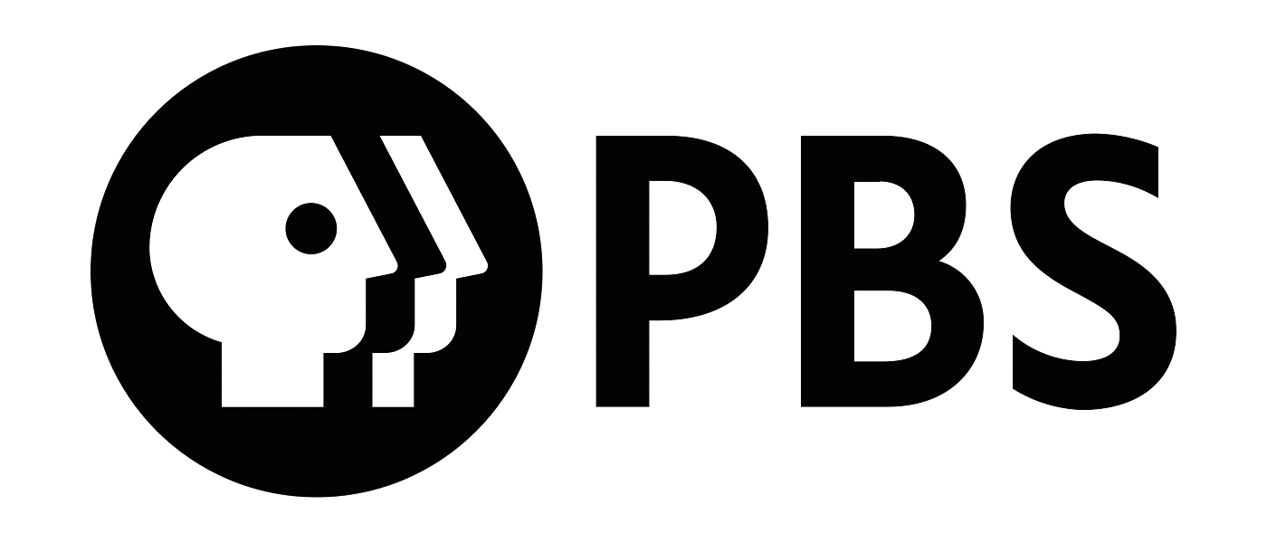
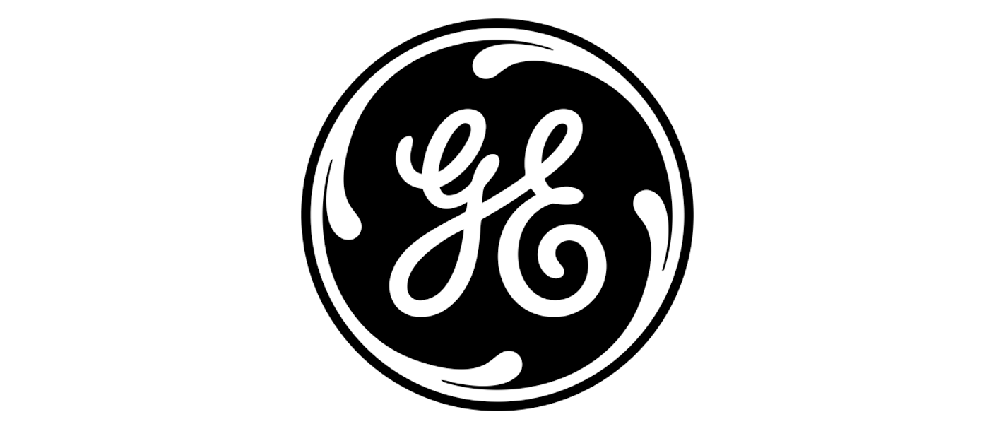


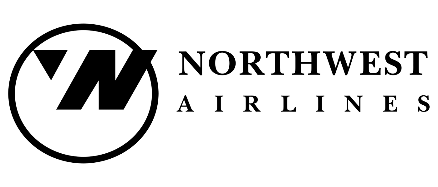
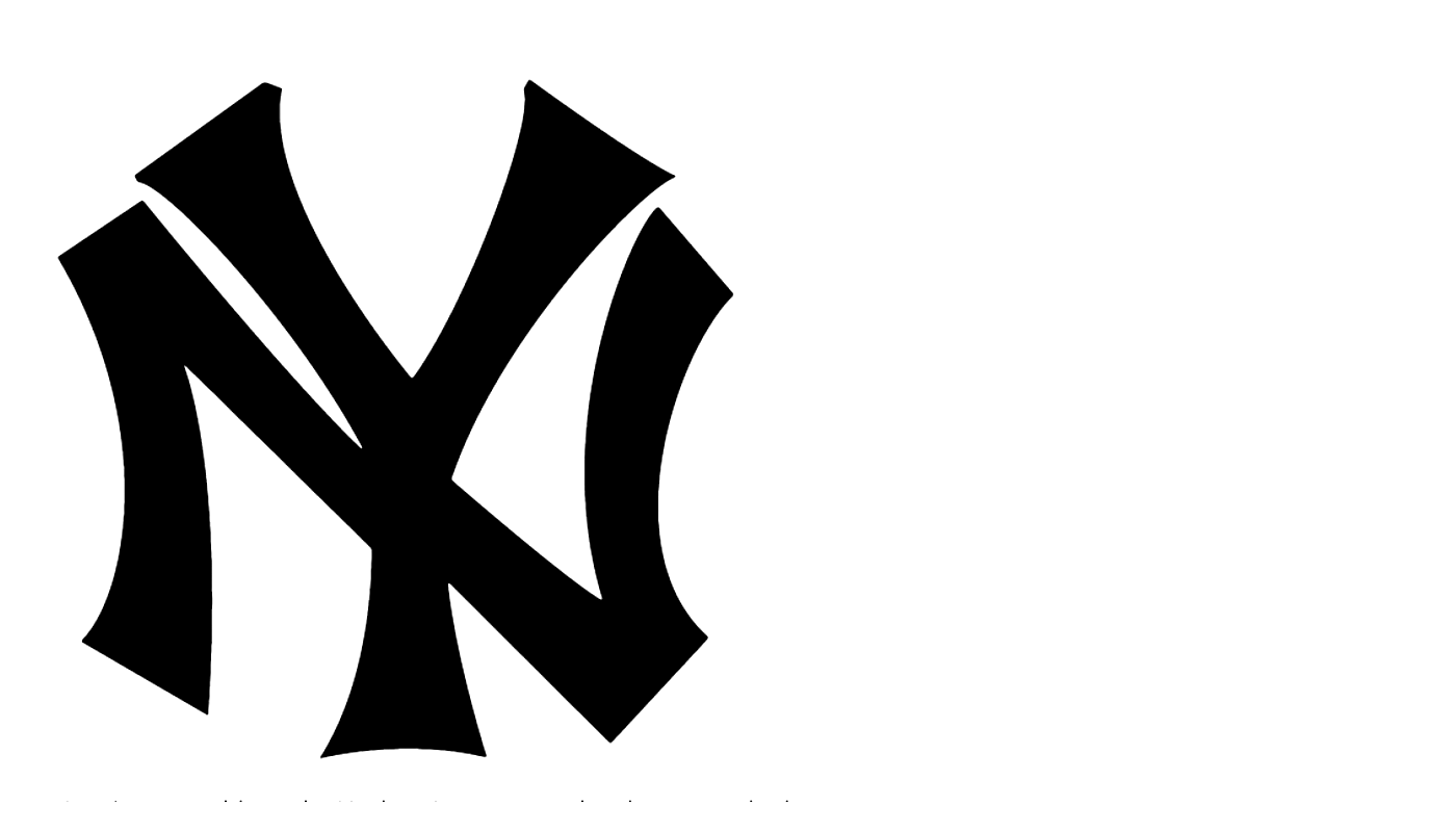
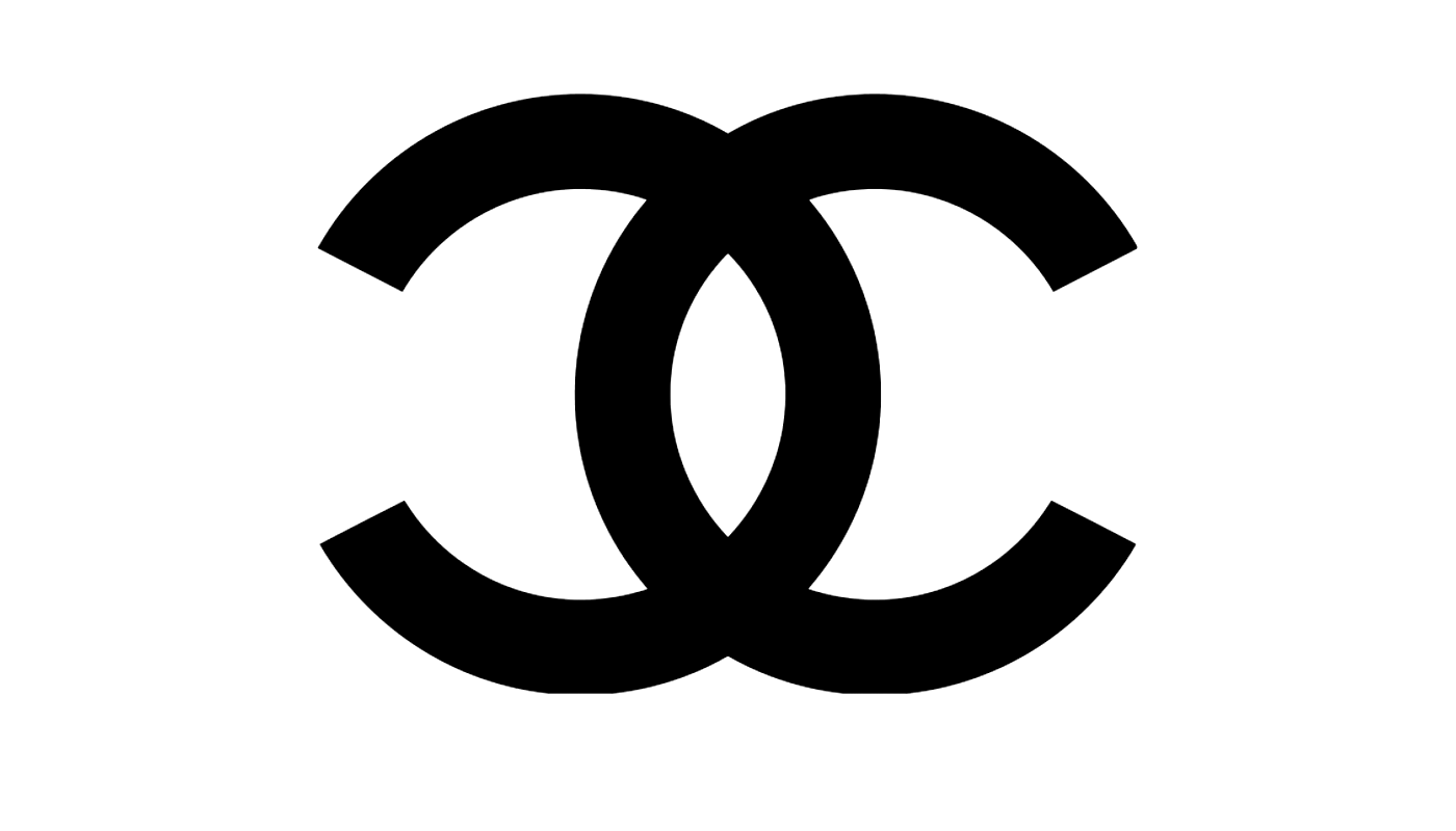
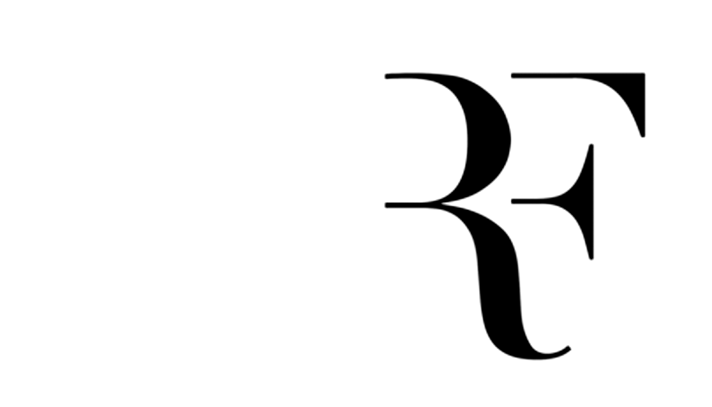
A logotype refers to words or the name of a business that is designed in a special way. Examples include: Pinterest, eBay, Yahoo, Coca-Cola, Google, CNN, Kodak, FedEx...
The Problem
Your task is to find interesting ways to combine and customize two or three letters—into one (memorable) typographic mark/logotype. The solution should rely exclusively on typography.How you do create a original, customized logotype for for yourself?
How you do create an easily recognizable logotype?
How can you make it work/legiable at multiple sizes.


Learning Objectives
_ explore the potential of letterform combinations
_ explore how to customized letterforms based on other letterforms
_ explore how to make customized letterforms using a grid
_ understand primary and secondary font combinations
_ understand and create a clear hierarchy when creating a resume
Project Deliverables
PDF Presentation (final presentation and process)
Applied as your profile image Instagram (circle)+ animated on Instagram (square)
Applied on as your profile image on Behance (it is a circle)
RESOURCES
George Bokhua
Logo Design w/Grids:
ch. 4: Sketching
ch. 5: Gridding
ch.r 6: Executing
( more )
Aaron Draplin
Customizing Type
ch. 7: sketching
ch.4: chopping
ch. 8: digitalizing
want more ( more )
Jessica Hische
Logotype Masterclass
Magic of LogoTypes
( more )
Logo Design w/Grids:
ch. 4: Sketching
ch. 5: Gridding
ch.r 6: Executing
( more )
Aaron Draplin
Customizing Type
ch. 7: sketching
ch.4: chopping
ch. 8: digitalizing
want more ( more )
Jessica Hische
Logotype Masterclass
Magic of LogoTypes
( more )
Brand New
BrandNew
Post University
Juventus
Formula 1
Gay and Lesbian Museum
Barcelona Century
Minestry of Sound
BrandNew
Post University
Juventus
Formula 1
Gay and Lesbian Museum
Barcelona Century
Minestry of Sound
Designers + Handlettering
Jessica Hische
Erik Marinovich
Amber Goodvin
Doyald Young | full movie
Gemma O’Brien
Marion Bantjes | full movie
Design Firms
Pentagram| @pentagramdesign
We are Collins | @thisiscollins
OCD : Original Champions of Design
Studio Mast Co | @studiomastco
Carpenter Collective
Jessica Hische
Erik Marinovich
Amber Goodvin
Doyald Young | full movie
Gemma O’Brien
Marion Bantjes | full movie
Design Firms
Pentagram| @pentagramdesign
We are Collins | @thisiscollins
OCD : Original Champions of Design
Studio Mast Co | @studiomastco
Carpenter Collective
Design Cannon/History
Michael Bierut (video)
Paul Rand | thinking form
Lance Wyman (video)
Herb Lubalin
Ivan Chermayeff
FHK Henrion
Otl Aicher
Bruno Munari
The letters must be customized you can’t just use letters in a font. You have to customize the lettters. No hand lettering is allowed for this project. Only perfectly crafted letterforms.
*Chances are you will not use this mark when you put your senior portfolio together. It maybe great now but not in the future. This project is based on going through the design process so that when you do have to make a mark this process is second nature.
You must find ways to combine the letters into an original customized monogram. If we find anything on-line or in books that looks like your solution you will fail this project and not pass the review. HOW do you assure that you are not coping? PROCESS you have to do it and you have to show it all. Every step.
![]()
![]()
![]()
![]()
![]()
![]()
![]()
![]()
![]() Examples: Letterform Combinations
Examples: Letterform Combinations
You may only the sheets you printed out with your 2 letters in different fonts / styles. You can print off more if you find you are missing styles, sizes...
Questions you need to answer by your sketches
How can you customize the letters into a logotype?
How can you use one letter to create another letter?
How can you make the round letters more square?
How can you make more square letters look round?
Try to make your round letters more rectilinear
Try to make all your straight letters more round
Try combining letters that are from different styles (what is a style?)
Try combining 2 different fonts.
Try combining using different sizes of letters.
Again using the sheets you printed out of your letters in different fonts/styles.
First make several Closure studies. How much of the letter do we need to see? Use the gestalt principle of closure. In this round also look for the form and counterform/ negative space to work out your solution.
Draw several closure studies out on tracing paper so you can layer and quickly sketch.
How can you customize the letters into a logotype?
How can you lock the letters together?
Can they share parts?
Can one letter need the other letter to form itself?
Using the sheet with grid. You can sketch onto the grid or use tracing paper. If you work in pencil make sure you go back and trace over with pen.
How can you use the grid to construct your letters?
How can you customize the letters into a logotype using the grid to make the letterforms?
How can you use one letter to create another letter?
How can you make letters out of just lines? Single or repeated.
This is where you get to be really weird. Just go for it. Take risks.
Organize all your sketches onto as many 8.5 x 11 sheets (landscape) as you need. Number and Label each sketch. You may have to cut your sheets apart and tape them back onto a sheet to organize them. You will eventually need to scan them all into the computer to put into your PDF Presentation due at the end of the project.
Print out your letters it at least 30 fonts/styles at 100pts tall.
Try all caps, all lowercase, reg, bold, light, condensed, extended, italic…
Label the typefaces you hvae chosen so you know what you are working with. Use the print outs to sketch from and you may print the letters out a different sizes but be logical: ex. 50pt and 100pt.
Print out the grid here it is! (or make your own)
Class One
Project intro
Start Sketching Phase 1 (work an hour a day on them)
Review: Classification according to form and construction.
Watch: Aaron Draplin Sketching
Watch: Jessica Hische Magic of Logotype
Watch: George Bokhua: chapter 5: Gridding Logo on Paper
Class Two
Working in class
Crit what you have and add 20 - 30 more sketches
Total 60 sketches due ( plus other things (try to work on these an hour a day every day). You must follow the prompts listed below -- no hand lettering. Remember a Hand lettered monogram will not be accepted.
"Looking for opportunities"
Get to know your letters! Classification according to form and construction.
"Getting weird"… Start Sketching: For this first round of sketches they have to be done by hand. Quick sketches by hand. Working quickly on DIFFEFENT IDEAS -- not the same idea over and over. Use the given font sheets or the grid sheets for all your sketches. You are tracing and manipulating (customizing) the letters based on the font sheets. It should be faster to come up with different ideas by hand. If you work in pencil make sure you trace over your sketches in pen so they are dark enough for everyone to see.
You are expected to create 60 analog (hand drawn/traced) typographic marks. No computer (for this round).
Take risks. There are hundreds of solutions you could do. You are trying to come up with 60 different solutions. Explore. Take risks. Work neatly.. If you work in pencil fill in with a black pen so we can see your ideas clearly.
Class 3
_ present and review 60 logotype designs
_ select top 6 ideas
_ start homework in class
_ student example
HOMEWORK
Step 1: Put your best 6 logotypes and put build them in Illustrator.
Pick a range of solutions. Range is important. Capture/write down notes on how they are customized and why you think they are the top 6. (should be part of your pdf. Part of the process is you taking notes. Making observations)
Step 2: From those 6 pick your top 3. Pick the ones you think are the most successful and interesting. Again RANGE. You want to show people how broad you and think/make.
Step 3: Create 5 variations of each of the top 3. *think Draplin
*keep track on what you are doing to customize (make notes)
How can you make the logotype better? More customize, more consistent or more contrast?
reference examples on these steps: Anne | Mollie | Kiran | Elia |
Keep organized while you are working or at the end of the day or before you get started. Take the time to organized your work/process.
Save all your explorations in a pdf and put it onto the google drive.
Remember how Draplin works (Watch some of Draplin wihle you are working!). You are “looking for opportunities. Drag and Duplicate and make changes. Look at the letters and make a decision and then try another. SAVE a lot.
*Also remmber you will only need to LOVE one mark all the rest of more for the experience of workign in illustrator and showing people you have RANGE. So work to impress.
Class 4
_ WATCH presentation video presenting logo
_ Crit
_ Pick best mark. Refine it
HOMEWORK
Refine final mark (final tweeks try 5 ideas)
What applications do you want to use to prototype your mark? See deliverables below.
Start to put together your final pdf presentation.
Concept and test a couple animated gif ideas. The gif should have some concept /reason to it. Try a few animations ideas before you come up with your final. Focus on showing us how your mark is created. Something interesting. You are not just blurring it or glitching it onto the screen. SIZE IS 640px x 640px
Create animated gif for instagram: !!!!! HERE ARE SOME TIPS !!!!!!
Gif size 640px x640pm (you can do it as a gif or do it in aftereffects hand in as .gif or .mov)
Test mark on as Behance and Instagram profiles.
Plan animated gif for Instagram and try it out. DIRECTIONS
Class 5
_ Present your refined mark, application ideas, animated gif ideas (have them animated),
HOMEWORK
Refine to handin -- see below
PROJECT DUE
POST YOU MONOGRAM
Change your Instagram profile image to your monogram*
Change your Behance profile image to your monogram*
Post animated gif on your instagram page (optional)
DIGITAL HAND IN
Presentation pdf. (yourname_presentation.pdf)
Yourname_Logotype.ai: Clean illustrator file with just your mark about 3 in tall or wide. Make sure it is clean. No live stokes the strokes shoudl be paths and you need to use the pathfinder to merge. Will look at your illustrator file for CRAFTand craft will be 10% of your grade.
Create a folder with your name and put your mark in illustrator, presentation pdf, resume pdf, business card pdf and animated gif/mov in the folder and upload it to the google drive.
PRESENTATION + PROCESS (use a grid)
Landscape :: WideScreen 1280 by 720 pixels
01. You name and Story or Challenge
*start with the logotype you went with for the final
02. Logo on White
03. Logo split screen (on white, on black)
04. Logo on white locked up with your name
05. Logotype in use.
06. Logo small and large
07. Show how your logotype is constructed
08. Storyboard of your animation 3 - 6 frames
09. Next …Logo on White
10. Logo split screen (on white, on black)
11. Next …Logo on White
12. Logo split screen (on white, on black)
13. All three top logos on one screen
Then AFTER those 13 slides in the same presentation you need to move onto process organized!
PROCESS
— 60 different logotypes. Organized. Labeled by prompt.
Identify the ones you think are working. Use as many screens as you need to show this step
— Your name at least 25 different ways (fonts, styles, case)
— Best 6 of your 60 put onto the computer (one screen)/identify which
— Best 3 you think are the strongest and why.
— Read the homework above that is what goes in your pocess. All of it. Leave anything out and it will drop your grade. You are graded on doing the work and how well you explored each prompt/homework. Some of you dial it in and it will be counted against you.
Animated Gif
Show process of your animated gif/mov (you should have at least 2 different ideas you explored)
*You will be able to change your icons/profile images back to your photo or whatever after I grade the project. They are on these social media outlets so we can see if it works small on-screen and in print. After I grade you can remove as much process as you want from your pdf when you show it to other people but for me -- now I need to see it all.
*Chances are you will not use this mark when you put your senior portfolio together. It maybe great now but not in the future. This project is based on going through the design process so that when you do have to make a mark this process is second nature.
You must find ways to combine the letters into an original customized monogram. If we find anything on-line or in books that looks like your solution you will fail this project and not pass the review. HOW do you assure that you are not coping? PROCESS you have to do it and you have to show it all. Every step.


prompt 1
20 sketches (min): parts of other lettersYou may only the sheets you printed out with your 2 letters in different fonts / styles. You can print off more if you find you are missing styles, sizes...
Questions you need to answer by your sketches
How can you customize the letters into a logotype?
How can you use one letter to create another letter?
How can you make the round letters more square?
How can you make more square letters look round?
Try to make your round letters more rectilinear
Try to make all your straight letters more round
Try combining letters that are from different styles (what is a style?)
Try combining 2 different fonts.
Try combining using different sizes of letters.
prompt 2
20 sketches (min): closure principleAgain using the sheets you printed out of your letters in different fonts/styles.
First make several Closure studies. How much of the letter do we need to see? Use the gestalt principle of closure. In this round also look for the form and counterform/ negative space to work out your solution.
Draw several closure studies out on tracing paper so you can layer and quickly sketch.
How can you customize the letters into a logotype?
How can you lock the letters together?
Can they share parts?
Can one letter need the other letter to form itself?
prompt 3
20 sketches: using a grid (min)Using the sheet with grid. You can sketch onto the grid or use tracing paper. If you work in pencil make sure you go back and trace over with pen.
How can you use the grid to construct your letters?
How can you customize the letters into a logotype using the grid to make the letterforms?
How can you use one letter to create another letter?
How can you make letters out of just lines? Single or repeated.
This is where you get to be really weird. Just go for it. Take risks.
Organize all your sketches onto as many 8.5 x 11 sheets (landscape) as you need. Number and Label each sketch. You may have to cut your sheets apart and tape them back onto a sheet to organize them. You will eventually need to scan them all into the computer to put into your PDF Presentation due at the end of the project.
Print out your letters it at least 30 fonts/styles at 100pts tall.
Try all caps, all lowercase, reg, bold, light, condensed, extended, italic…
Label the typefaces you hvae chosen so you know what you are working with. Use the print outs to sketch from and you may print the letters out a different sizes but be logical: ex. 50pt and 100pt.
Print out the grid here it is! (or make your own)
Class One
Project intro
Start Sketching Phase 1 (work an hour a day on them)
Review: Classification according to form and construction.
Watch: Aaron Draplin Sketching
Watch: Jessica Hische Magic of Logotype
Watch: George Bokhua: chapter 5: Gridding Logo on Paper
Class Two
Working in class
Crit what you have and add 20 - 30 more sketches
Total 60 sketches due ( plus other things (try to work on these an hour a day every day). You must follow the prompts listed below -- no hand lettering. Remember a Hand lettered monogram will not be accepted.
"Looking for opportunities"
Get to know your letters! Classification according to form and construction.
"Getting weird"… Start Sketching: For this first round of sketches they have to be done by hand. Quick sketches by hand. Working quickly on DIFFEFENT IDEAS -- not the same idea over and over. Use the given font sheets or the grid sheets for all your sketches. You are tracing and manipulating (customizing) the letters based on the font sheets. It should be faster to come up with different ideas by hand. If you work in pencil make sure you trace over your sketches in pen so they are dark enough for everyone to see.
You are expected to create 60 analog (hand drawn/traced) typographic marks. No computer (for this round).
Take risks. There are hundreds of solutions you could do. You are trying to come up with 60 different solutions. Explore. Take risks. Work neatly.. If you work in pencil fill in with a black pen so we can see your ideas clearly.
Class 3
_ present and review 60 logotype designs
_ select top 6 ideas
_ start homework in class
_ student example
HOMEWORK
Step 1: Put your best 6 logotypes and put build them in Illustrator.
Pick a range of solutions. Range is important. Capture/write down notes on how they are customized and why you think they are the top 6. (should be part of your pdf. Part of the process is you taking notes. Making observations)
Step 2: From those 6 pick your top 3. Pick the ones you think are the most successful and interesting. Again RANGE. You want to show people how broad you and think/make.
Step 3: Create 5 variations of each of the top 3. *think Draplin
*keep track on what you are doing to customize (make notes)
How can you make the logotype better? More customize, more consistent or more contrast?
reference examples on these steps: Anne | Mollie | Kiran | Elia |
Keep organized while you are working or at the end of the day or before you get started. Take the time to organized your work/process.
Save all your explorations in a pdf and put it onto the google drive.
Remember how Draplin works (Watch some of Draplin wihle you are working!). You are “looking for opportunities. Drag and Duplicate and make changes. Look at the letters and make a decision and then try another. SAVE a lot.
*Also remmber you will only need to LOVE one mark all the rest of more for the experience of workign in illustrator and showing people you have RANGE. So work to impress.
Class 4
_ WATCH presentation video presenting logo
_ Crit
_ Pick best mark. Refine it
HOMEWORK
Refine final mark (final tweeks try 5 ideas)
What applications do you want to use to prototype your mark? See deliverables below.
Start to put together your final pdf presentation.
Concept and test a couple animated gif ideas. The gif should have some concept /reason to it. Try a few animations ideas before you come up with your final. Focus on showing us how your mark is created. Something interesting. You are not just blurring it or glitching it onto the screen. SIZE IS 640px x 640px
Create animated gif for instagram: !!!!! HERE ARE SOME TIPS !!!!!!
Gif size 640px x640pm (you can do it as a gif or do it in aftereffects hand in as .gif or .mov)
Test mark on as Behance and Instagram profiles.
Plan animated gif for Instagram and try it out. DIRECTIONS
Class 5
_ Present your refined mark, application ideas, animated gif ideas (have them animated),
HOMEWORK
Refine to handin -- see below
PROJECT DUE
POST YOU MONOGRAM
Change your Instagram profile image to your monogram*
Change your Behance profile image to your monogram*
Post animated gif on your instagram page (optional)
DIGITAL HAND IN
Presentation pdf. (yourname_presentation.pdf)
Yourname_Logotype.ai: Clean illustrator file with just your mark about 3 in tall or wide. Make sure it is clean. No live stokes the strokes shoudl be paths and you need to use the pathfinder to merge. Will look at your illustrator file for CRAFTand craft will be 10% of your grade.
Create a folder with your name and put your mark in illustrator, presentation pdf, resume pdf, business card pdf and animated gif/mov in the folder and upload it to the google drive.
PRESENTATION + PROCESS (use a grid)
Landscape :: WideScreen 1280 by 720 pixels
01. You name and Story or Challenge
*start with the logotype you went with for the final
02. Logo on White
03. Logo split screen (on white, on black)
04. Logo on white locked up with your name
05. Logotype in use.
06. Logo small and large
07. Show how your logotype is constructed
08. Storyboard of your animation 3 - 6 frames
09. Next …Logo on White
10. Logo split screen (on white, on black)
11. Next …Logo on White
12. Logo split screen (on white, on black)
13. All three top logos on one screen
Then AFTER those 13 slides in the same presentation you need to move onto process organized!
PROCESS
— 60 different logotypes. Organized. Labeled by prompt.
Identify the ones you think are working. Use as many screens as you need to show this step
— Your name at least 25 different ways (fonts, styles, case)
— Best 6 of your 60 put onto the computer (one screen)/identify which
— Best 3 you think are the strongest and why.
— Read the homework above that is what goes in your pocess. All of it. Leave anything out and it will drop your grade. You are graded on doing the work and how well you explored each prompt/homework. Some of you dial it in and it will be counted against you.
Animated Gif
Show process of your animated gif/mov (you should have at least 2 different ideas you explored)
*You will be able to change your icons/profile images back to your photo or whatever after I grade the project. They are on these social media outlets so we can see if it works small on-screen and in print. After I grade you can remove as much process as you want from your pdf when you show it to other people but for me -- now I need to see it all.