Andrea Herstowski
aherstowski@ku.edu
office hours by appointment
Google Drive
Fonstruct :: Fonstruct Demo
Illustrator Template
Glyphs app
Modular Font: Parts Make the Whole
Any lettering or type is based on a system. The alphabet is a typographic system with a set of (visual) rules and guidelines that help govern the decisions involved in creating letters. These implicit systems enable characters to work together, by regulating and defining their appearance—dictating their shapes and sizes, how they fit together, and their visual spirit, as well as all other underlying tenets of the letters.
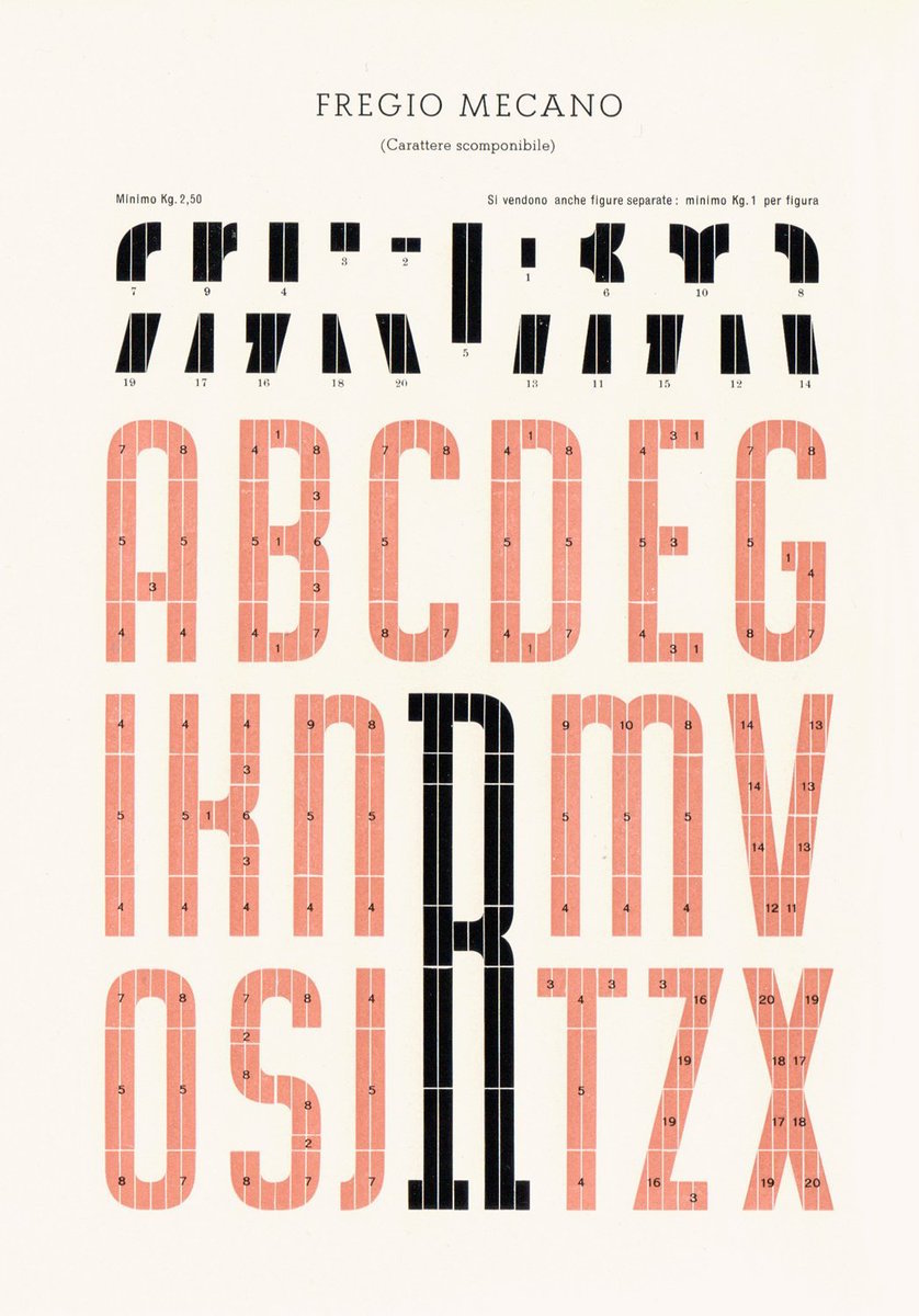
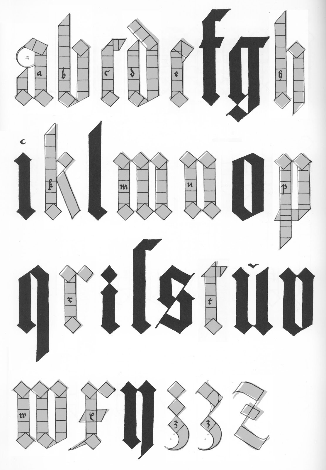
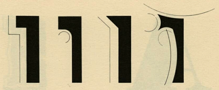
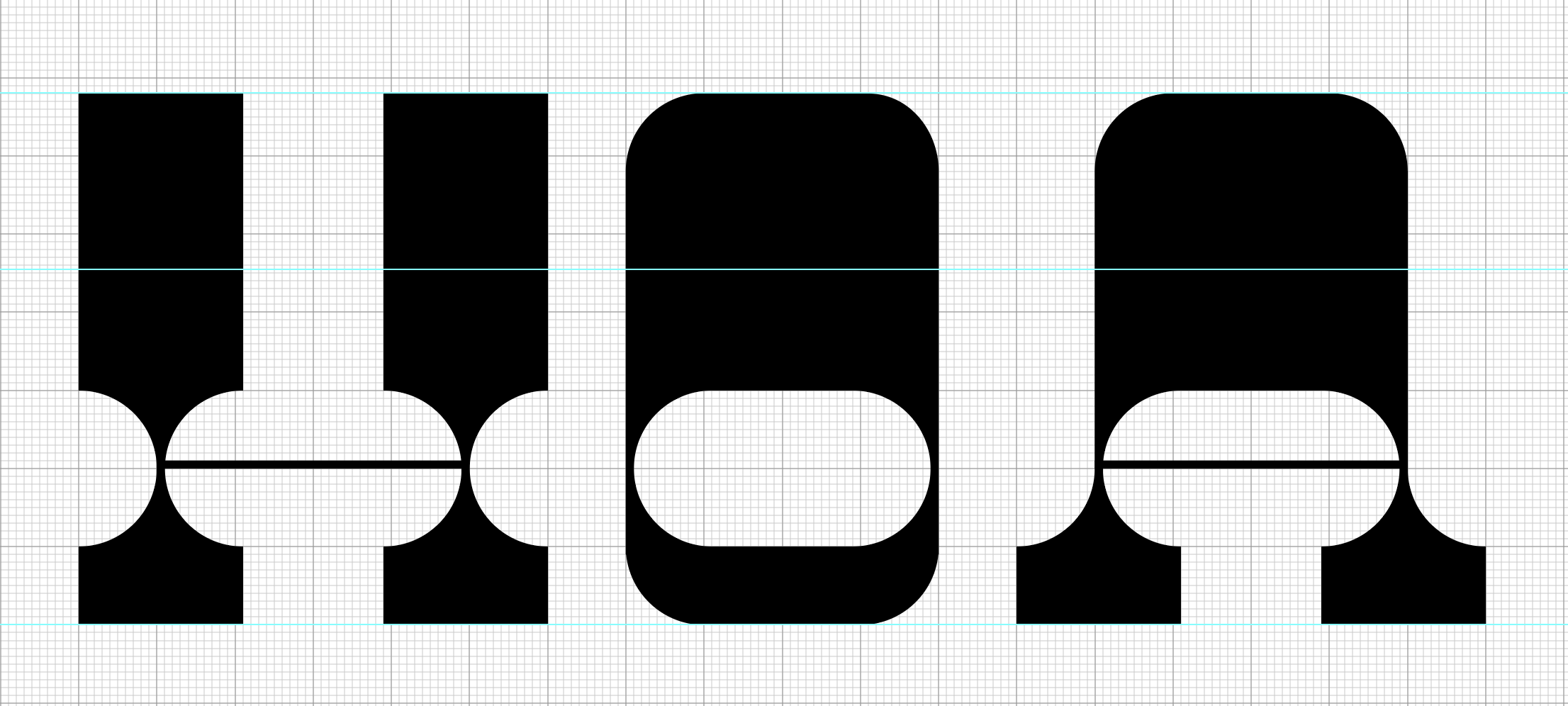
A modular typeface is an alphabet constructed out of a limited number of shapes or modules. Modular describes any letter assembled from a limited palette of distinct elements, repeated, flipped, and flopped but not scaled. Typically these elements are geometric and simple in shape—square pixels on a digital display or modernist circles, squares, and lines.
Traditionally, modular lettering has responded to the limitations and possibilities of the media used to create it. Today designers are using more ornate, complicated, and/or organic forms (modular units) and even physical objects to construct modular letters. They have taken a broader approach to modular letter-forms, pushing the possibilities to create letters from more complicated elements.

The task of Parts Make the Whole is to design a prototype for a modular font by using a letter construction context. The typeface must include at all 26 characters, either in upper-case or lower-case, or a unicase. Unicase combines typical features of both cases. The letterforms should be modular, rational, and repeatable, meaning that parts of the letters are used to create other letters. The design process should begin with creating letters on a grid of squares or dots.
Handlettering or creating letters based on an existing font is not allowed; the letters must be constructed.

Explore the modular system. Once defined, refine the letters to something new and less expected, the new will become the system to create all 26 letters of the alphabet. Work in Adobe Illustrator and use the software Glyphs to output the final set of upper or lower case letters as a usable, shareable, typeface.
Explore your modular system. Once you have defined your system, made some letters, refined them to something new, the new will become your system to create all 26 letters of the alphabet. We will work in Adobe Illustrator and you will use the software Glyphs to output your final set of upper or lower case letters as a usable, shareable, font.
You may find it useful to refer to the reference section and the the works of Wim Crouwel’s grid-based fonts, Phillip Apeloig, early fonts by Zuzana Licko/Emigre and Hamish Muir...
*Please use all the resources given, they are there to help you.
LEARNING OBJECTIVES
_ understand the anatomy of letterforms/characters/glyphs
_ explore the expressive potential of typography
_ solve communication problems within given parameters
_ methodically document relevant design inspiration and process
_ present and assess work in a visually and verbally articulate manner
_ professionally document outcomes
_ demonstrate exemplary visual craft—hand and digital
_ Adobe Illustrator (pathfinder, clean vectors)
_ Glyphs App (beginner level of the Glyphs program) MAC only.
SOFTWARE
Adobe Illustrator
FontStruct (free web-based software) (created a tutorial for you)
Glyphs app: https://glyphsapp.com/ it is MAC only software.
Trial version is available MAC only and is for 30 days so don’t download it yet.
PC people you can use a combination of illustrator and the Glyphs app.
*You will have to use the 313 lab for the glyphs app.
PROJECT DELIVERABLES
working font (all caps or all lowercase -- not both)
process book
behance post (examples)
PROCESS BOOK
Process Book will be digital and a pdf. It must be well organized, labeled, name on it!. Make sure you include:
_ Your Name
_ Project Description
_ Project Overview
_ All of the process, notes you took, construction
_ final product.
**All the homework, feedback, class notes etc go into the process book. Don't forget a title page with the name of the project and your name, project description (what was the project), project overview (your thoughts on the project), all your process (all of it! organized by date).
Process Book Examples Anne | Kate | Abby |
RESOURCES
Bauhaus and Art Deco
Wim Crowel
Early Type Design
Fonts and foundry or type house
:- by Foundry
:- Type Wolf
see Resources for more
PEOPLE
Wim Crowel
Phillip Apeloig
Emigre/ Zuzana Licko
Hamish Muir
:- future fonts
:- type in use
:- type class *follow
:- oh no
:- studio type
:- font of the month club
:- burn type
:- studio marlonilg
FILES & LINKS
drawing font (lettter fountain)
anatomy video
glossary here
pdf compilation Anatomy refresher.pdf
https://adhesiontext.com/
*does not work in Chrome
CALENDAR
Introduction

A modular typeface is an alphabet constructed out of a limited number of shapes or modules. Modular describes any letter assembled from a limited palette of distinct elements, repeated, flipped and flopped but not scaled. Typically these elements are geometric and simple in shape—square pixels on a digital display or modernist circles, squares, and lines.
Traditionally, modular lettering has responded to the limitations and possibilities of the media used to create it. Today designers are using more ornate, complicated and/or organic forms (modular units) and even physical objects to construct modular letters. They have taken a broader approach to modular letter-forms, pushing the possibilities to create letters from more complicated elements.
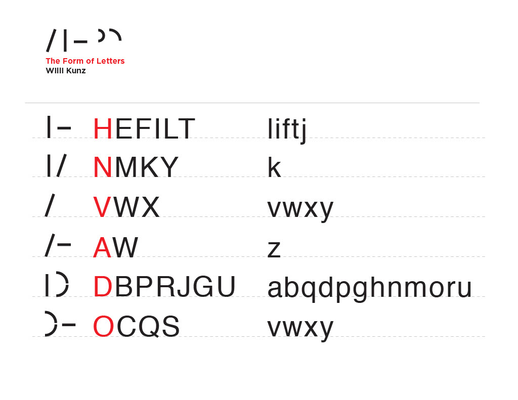
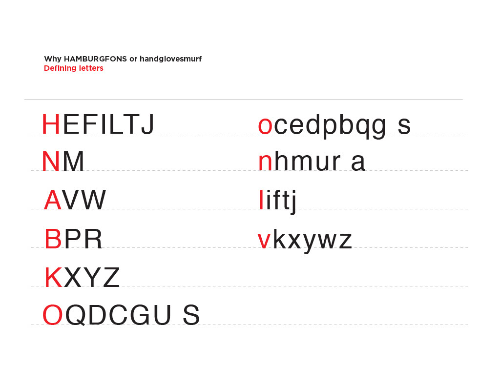
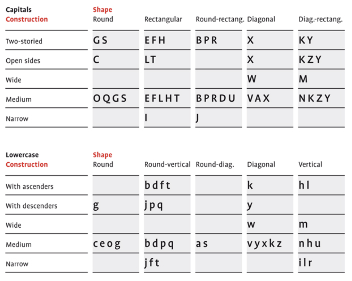
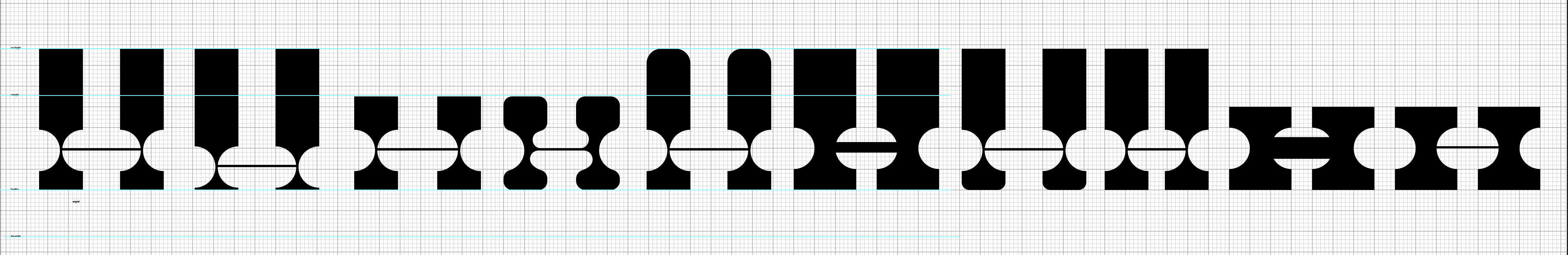
When designing fonts you always start with a few core letters, such as handgloves or hamburg and then you build out the rest of the alphabet from there. As you can note from the chart below once you have the Cap H you can get the letters E F L T, once you have the B defined you can to the P R. etc. The same principle goes with the lower case. If you start with the h you can easily get to n, u, l, i, m, r. The d gives you an idea of the p, b, q... etc.
The chart below shows once you have the Cap H you can develop the letters E F L T.
Once you have the B defined you can to the P R. etc.
The same principle goes with the lower case.
If you start with the h you can easily get to n, u, l, i, m, r.
The d give you an idea of the p, b, q... etc.
When designing a typeface always begin by figuring out the core letters. The word HANDGLOVES, handgloves or HAMBURG, hamburg gives you the core letters.
Monday, February 27
Intro to the project
The Modular Letter Lecture
Typographic Systems forms of construction.pdf
Grids for sketching.pdf
Introduction to FontStruct / recorded demo
the modular part one | part two | part three |
In small groups discuss and capture (take notes) on what you observe looking at the following links. Appoint a note taker and share your notes with each other to include in your presentation and process book
_ apeloig.com/type/typography
_ muirmcneil.com/projects/ :: instagram.com/muirmcneil
_ https://twitter.com/hashtag/TypeSystemGrid
Before you leave class make sure you understand the homework and the difference between handlettering and constructed letterforms/characters. You can only make constructed modular letterforms.
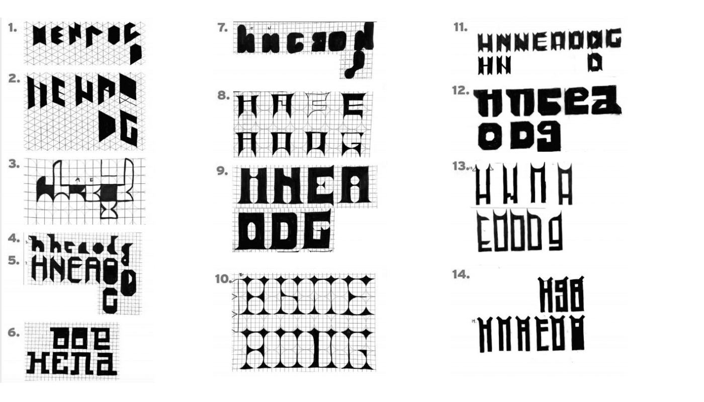
Getting Started... You can draw all uppercase or lowercase. Try both. Try all uppercase H, E, N, A, O, D, G. Try all lowercase n, h, e, a, o, d, g. The main rule is the letters must be constructed and based on some set of modular forms.
Define a kit of modular parts -- shapes that you can combine, stack, rotate, flip to build a letterform) Sketch the letters (H, E, N, A, D, O, G ... or ... n, h, e, a, o, d, g) using that system. Use as many or few shapes as needed for the set.
Keep in mind that smaller grids provide a more limited set of design options.
Do not scale or distort any of the components. Do not overlap the elements or use a white shape knocked out of black forms. Fewer grid units provide a more limited set of design options.
Start Sketching Sketch as neatly as you can. Keep organized. Range of solutions is better than tring to get on idea perfect. You have time ot make something perfect. Now is the time to explore options.
Write down the checklist and keep it in front of you.
The main rule is the letters must be constructed = based on some set of modular forms.
__ alll caps : H, E, N, A, D, O, G.
__ all lowercase: n, h, e, a, o, d, g
__ unicase
__ tall (condensed), thin stroke / __ short (extended), thin stroke
__ tall (condensed), bold stroke / __ short (extended), bold stroke
__ tall (condensed), super heavy / __ short (extended), super heavy
__ try sans serif / __ try serifs
__ try different types of serifs
__ try to work in different sizes: more grid units
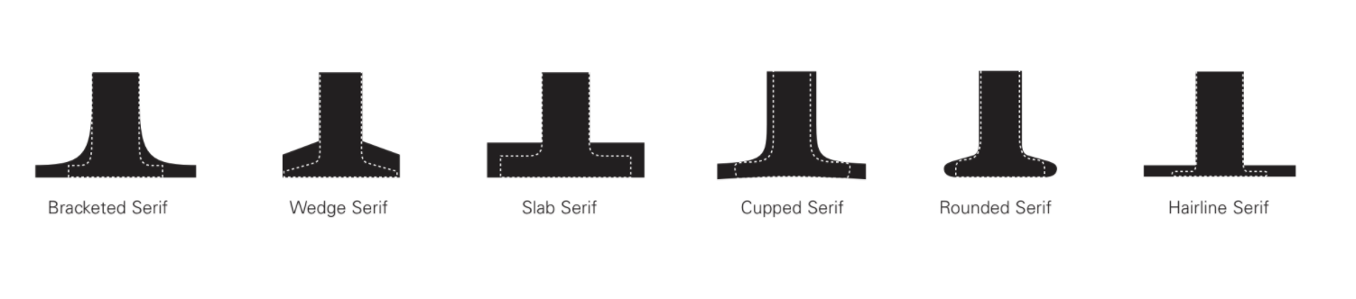
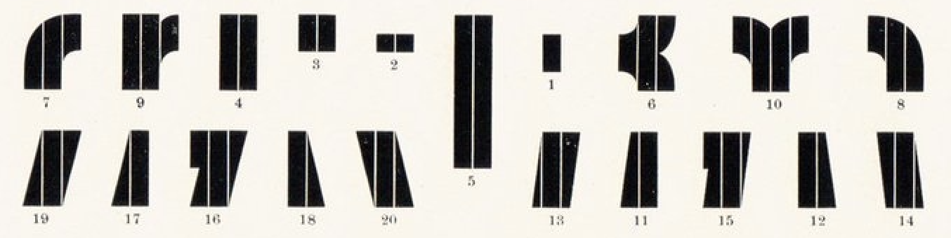
Diagram by Rob Roy Kelly, America Wood Type
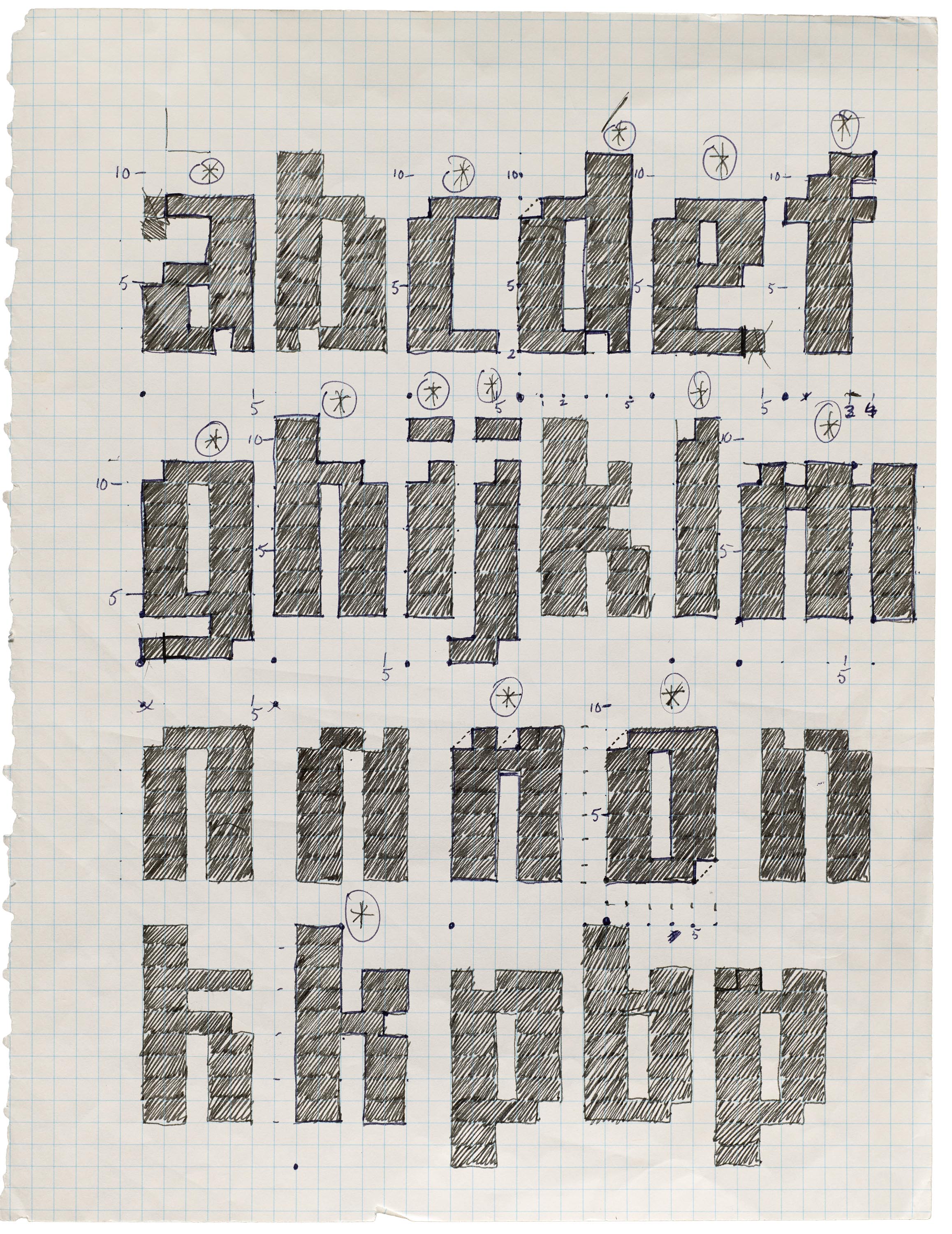
sketching examples
Introduction to FontStruct
/ recorded demo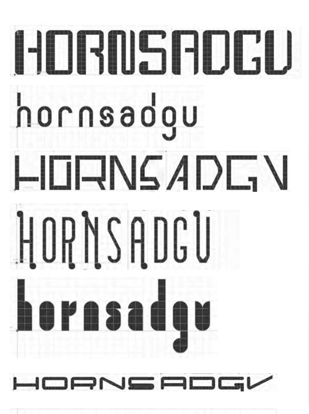
HOMEWORK
Explore / Sketch
Watch: Gail Bichler
Watch: Matt Willey
Read: Ugliness in Type Design
Handout: Homework.pdf
EXPLORE + CREATE
| examples | Anne | Kate | Abby |
20 sets/font ideas, each set has 7 key letters H, E, N, A, O, D, G (if you are drawing caps draw them in this order -- should make sense why...
or
n, h, e, a, o, d, g (if you are drawing lowercase draw them in this order -- should make sense why...
*the a and g can be one story or 2 story try both
yes it is a lot
20 sets with 7 letters in each set. a set is a design direction.
do not draw the letter H 20 times, then 20 letter E or e. Work in sets, the letters should go together the H should inform the E (n inform the h) get it?
Try not to fill your pages give your different ideas some space around them.
Work in different sizes/ work in different proportions .
Organize your sketches while you are working. Number them.
Use as many pages as you need to keep things organized and clear. Start by using the handouts to create the your initial studies. Once you get started you can also create your own grids/parts/ modulars. EXPLORE have fun. This should not be torture. Ugly is awesome. You have to make. The only thing you can't do is hand-letter letterforms. You just can't hand draw letters they have to be constructed. Make sure you know what this means before you start your homework!
You can do all 20 studies by hand (each study has 7 letters in them)
OR 10 studies by hand and 10 in Fonstruct (you have to save and show them). If you hate fontstruct then don't use it! just try and and decide if you LOVE it you can only make 10 different fonts for your homework the rest have to be by hand)
Explore. Should be fun not torture. Fonstruct Shortcuts
** try both. don’t just construct CAPITAL LETTERS or don’t just construct lowercase letters for the different sets try different ones.
H, E, N, A, O, D, G /or/ n, h, e, a, o, d, g
Bring everything to class in physical form (ie not on your computer. PRINT everything so we can all see what you have created. *if you have trouble printing out of FontStruct take a screen shot and print it.
While you are working…
look through your sketches and if they are not organized, start to organize the sketches. You can cut them out of a page and tape them down onto another paper to get them organized. If you used tracing paper you may want to do this.
If you look through your sketches and you noticed you rushed or maybe you have a lot that look the same. Take some time and to look at what you have done and sketch a couple more ideas. You want to have a range of choices.
Look though your sketches and mark the ones you like, are the most interesting, that you want to continue working on.
Recap for Wed.
— 20 sets of the 7 letters, nice variety and neatly organized
— Sketches printed out and ready to talk about.
— Favorite 5 marked in some way.
Wednesday, March 1
Sam
Picking most interesting 3 to build in illustrator and create variations of.
(Do this in class, now...)
Your process book is digital.
Take a photo (you can use your phone)
Make sure you rotate your images so they are right reading (that we don’t have to turn our head)
Make a folder with your name and all you photos/scans onto the google drive.
Document Grid. It is important and turns out to be extremely useful if you take the time to adjust the document grid to work for you. This way you can use the snap to grid option in Illustrator. Will keep your vectors clean and consistent.
Watch: Snap to Grid
Key is to adjust your grid to work for you watch at at 2:05
WATCH: these | or top 10 illustrator tips |-> need a bit of an illustrator refresher?
HOMEWORK
Template
Adjusting document grid
Variations
Use the template
Yes the template is big. USE THIS TEMPLATE! YOU WILL BE SAD LATER. So you may have several art boards.
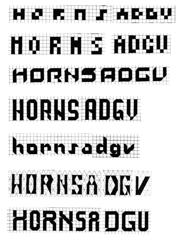
Choose 3 most successful/interesting studies H, E, N, A, O D, G /or/ n, h, e, a, o, d, g , and put them into illustrator.
In Illustrator start by recreating the modules you need to build your letterforms. Use the grid and snap to it.
![]()
![]()
After you get your 3 sets in illustrator try variations of the H or n. Make the letter taller, wider, heavier, rounder (be selective on what you make round. (how can you make the letters better, more interesting?). *this is a key step in making your letters different from everyone else in the class -- you have to explore options.
![]()
From those studies on the H/or/n pick out 3 (any three from any of the sets you have made).
Three that you like and then do the full set again in that variation H, E, N, A, O D, G /or/ n, h, e, a, o, d, g.
Play out at least 3 variations in total.
If you didn't use serifs can you add serifs?
Can you change the serifs?
Can you change the proportion of the letter? c
Can you change the weight of the letter....
lots of options!
repeat of directions...
1) draw the 3 original sets in illustrator (even if you use fontstruct recreate them in illustrator). Set your baseline grid. Create the modulars and draw them in a smart and clean way using snap to grid.
2) take the H or n from each set and play with variation EXPLORE (at least 9 variations of the H or n)
3) from your H or n variations studies pick 3 different ones build them out to the rest of the letters H, E, N, A, O D, G /or/n, h, e, a, o, d, g
recap
for Monday you should have 3 original sets drawn nicely in illustrator, exploration of H or n for each set. Create 3 more sets from a variation. In total you should have 6 sets total in illustrator to choose from. The variation is your opportunity to explore how far you can push the modular/rational letterform.
Print everything out for class crit. And Save as a pdf for your process book.
Something to start thinking about is how you are going to put this all together in a process book so you don't have to do that in the end.
Feel free to contact me (email me) this weekend if you have questions or if you need some feedback. I hope you all can get on track for Monday. Or post some sketches on Slack so your peers can see and or give you feedback.

Monday, March 6
Picking most interesting 2.
*you may not have 2 great ones to choose from so you need to keep working until you do. This is your chance to catch up.
Hang Up.
Hang Sections.
Think about uses or personality.
HOMEWORK
Adding letters to your top 2 directions. Use the template
*it is very important that you use the template. It is given to you for a reason. Use it.
Add T I U S M K X W Z /or/ i u s m k x w z
![]()
While you are working by hand or on the computer you will find some letters give you trouble, just keep making variations of that letter and you will be able to pick the best option. (k, n, b, p) – LetterformArchive.org/emigre.
Explore different solutions to letters that are giving you trouble, refine in Illustrator. Please keep adding to the template.
By adding the next of letters you are testing out your modular system and hopefully finding your favorite direction. And pushing your idea further.
Start thinking about how you could use it.
And what personality/mood does it feel like?
Print out for class. Save as a pdf for your process book
*reminder to work on your process book :)
Wednesday, March 8
Walter Tracy: Letters of Credit
Spacing pdf: Spacing
Open Type Features in Illustrator: Video
InClass
Picking most interesting ONE directions to refine.
Refine any letters you have done so far. What letters are still giving you trouble.
Look at your illustrator file and can the letters be more clean?
If you have used strokes (lines) all links have to be outlined into shapes.
Look at the stroke weights and correct -- they should be consistent.
Look at the counter shapes and correct -- they should be consistent.
Defining personality/feeling/mood (starting Toolkits)
Write down some reasons WHY you pick this direction.
What words would you use to describe your font? (sharp, soft, constructed, scifi, romantic, dramatic, vintage...
If it had an emotion -- what would it be?
If it had a personality -- what would that be?
Make a long list ^
Pick least 3 - 6 words that describe the mood, tone, emotion, personality of your letters.
Imagery start looking for images that match or enhance or question your mood tone...
Find 6 – 12 different photo/ illustrations so you have some choice (you can pick from)
Please only find copyright free.
See the class syllabus for a list of image sources<-- use the list!
HOMEWORK (over spring break)
Cleaning up illustrator file and prep your illustrator file.
After Spring break we will start to copy and paste into Glyphs. In Illustrator first SAVE AS do not save over your sketches. SAVE AS name it something new and merge all your parts and clean up the letters. Please put you illustrator file on the google drive
Name your Typeface (you can have a couple of options if you want)
Tool Kits. For your final typeface create 2 different tool kit ideas based on different moods or personalities. Tool kit is a one stop shop for all the assets you will need when creating your final post. You chould be able to open your toolkit when you are designing your behance post and have everything you need. Design the toolkits in Adobe Illustrator.
Toolkit should include: Name of the font, 3 words to describe it, 1 - 3 images/illustrations, color palette, pangram/quote, secondary font if needed, modules used to create your letters. Print out and save as a pdf for your process book.
Only for a bit of context. Here is some inspiration for where you can take your font and the final presentation. At the end the font is due. Part of this homework is starting to get the things you need for the final.
Watch: Tina Smith's Food for Thought (summary/thoughts must included in your process book)
- - - - -
If you are on a MAC download the trial version of Glyphs.
You need it when class starts so download it before class starts on Monday.
After Spring Break I will demo Glyphs and we will work together. Please have your illustrator files on a google drive or dropbox so you can easily download them to a school machine.
Spring Break
Monday, March 20
You have ^ homework do it :)
Tina Smith -- Thoughts
ToolKits
Download FREE Trial of Glyphs if you have a MAC.
Stem Thickness Window > Plugin Manager
Find Stem Thickness
you may have to install something restart Glyphs, then install the plug in.
INTRO TO GLYPHS (if you missed Monday’s class or need to rewatch)
Overview Demo
Plugins Demo
How to Copy and Paste from Illustrator to Glyphs
UPPERCASE Demo
lowercase demo
Tip
Work on your Glyphs file not the otf file :) *** IF YOU GET STUCK YOUR JUST MESSAGE ME IN SLACK OR EMAIL.
HOMEWORK
Finish all the 26 characters: all the lowercase OR all the uppercase. You can draw them in illustrator and copy and paste into Glyphs or you can just draw them in Glyphs. If you want to do numbers or some punctuation that is optional.
*Make variations of the letters that are giving you trouble. *if the s is giving you trouble then try a few versions of or the g or w or whatever letters now is the time to explore the trouble letters. Remember it might be easy to turn one letter into another one. Do that when possible. Refer to the handout forms of construction.pdf.
Think of a name for your font. Name it. Save your glyphs file AND export it and test it out in illustrator!!! Type out your letters in a pangram. Save as a pdf and bring a print out to class so we can see your letters.
Wednesday March 22
Walter Tracy: Letters of Credit
Spacing pdf: Spacing
Open Type Features in Illustrator: Video
Demo Making Patterns in illustrator
Making patterns (make at least 3 before you leave class)
Starting thinking about animations: one should explain your modular, how it is used.
Working in class to explore options, refine, correct letter spacing.
Open your font in Glyphs.
_ Glyphs: Questions : what do you need help with?
Export your font, add it to font book and open illustrator.
Create a pangram at least 120 point tall and 36 pt tall.
_ crit letters, what are the problem letters?
_ how is the letterspacing?.
Glyph Tips
Diamonds are everyones best friends
Double check that all your letters are on the baseline
Double check that all your letters go up to the x-height or cap/ascender height.
-> If you need me to help you get your guides set please say so.
Side Bearings
What are they, How do you change them all at once
Check your L I T J Q U c e j k l
easiest way is to look at letters using a control letter H or n
HIHTHIHJHQUH or ninitinjnquncnenlc
*and remember to kern in illustrator, you have the control
Background layer
command B, screen turns pink when you are in the background
HOMEWORK
Start thinking /planning how to show off / teach us about your font.
What could be a compelling way to show off your font? Make a Pattern? Construction, Modules, a Quote, a lyric, poem, just words. What image(s) enhance the feeling or set the mood of your font? You started this now be more selective (maybe you need to research a bit more). What words can you use to show it off? (what are your favorite letters and what words use them? if you hate a letter don't use it :) Find a pangram you want to use. Or create your own.
Refine any letters that are still giving you trouble. Work on your letter and word spacing. Start making your process book so you can just add to it and not have to design it the night before.
Examples Anne | Kate | Abby |
1) Testing. Test your font at different sizes so you know how SMALL you can use it in a behance post. Also test how small you can use your secondary font. Change it to your fonts, change the words to your words... turn off the direction layer. Post to your behance so you can see them in context. (and make sure you have in your process book)
2) Patterns. before moving on to the tool kit play with making patterns. Use the Pattern Options under window. Play making patterns out of dots, squares, lines, maybe a letter, maybe your modules... just play so you understand how to make, use and edit patterns. You may end up not using patterns for this project but it is the time to learn about them so just embrace the learning experience! :) Make at least 10 patterns so you understand all the options in pattern maker. Include them in your process book.
![]()
3) Starting to think about ... Part of the final will be presenting your modular system, show how it is used, and describe 3 to 6 characteristics of your font. You will need to visual show and verbally explain characteristics about selected letters -- we will call this Show and Tell. sheet of examples | 1 | 2 | 3 | 4 | 5 | What is important is at this stage you Explore. I don't want to give you any more direction than that: be inspired by the possibles by looking at apeloig posters, patterns by MuirMcNeil... Think of how to manuals or exploded views or …. try different ways to diagram the letters. (don't just do these examples! Starting sketching/ writing down ideas on how you want to show your entire alphabet, how do you want to show off one letter series of letters. How do you want to explain both visually and using typed words to describe the characteristics of your font/letters. How do you want to show how a letter(s) are constructed with your system. Start looking at examples online. Bookmark, collect (google drive, pinterest or are.na, take notes, sketch your ideas.
4) Tool Kits. Create 2 different tool kit ideas based on different moods or personalities. Tool kit is a one stop shop for all the assets you will need when creating your final post. You chould be able to open your toolkit when you are designing your behance post and have everything you need. Design the toolkits in Adobe Illustrator.
Toolkit should include: Name of the font, 3 words to describe it, 1 - 3 images/illustrations, color palette, pangram/quote, secondary font if needed, modules used to create your letters, highlight at least 3 characterisics "show and tell" you need words (use your secondary font, pattern(s) (optional).
Discuss homework.
We understand this is abstract – it is time for you to try and find your own way. How are you going to show off your font on a behance post?. You must have all the content above in any order. Remember your Behance post/page can go very LONG, scrolling is great, do not cram it all in.
examples: https://www.behance.net/collection/188877001/Modular-Font-Examples
HOMEWORK
Craft is king. What do you have to fix to have perfect craft?
Practice Animations (these are practice you will have to make new for your final, treat them as practice)
Build out 2 Behance posts think of them as sketches.
Practice Frame by Frame Animations. Make at least 2 (you will have to remake them for the final).
Practice Time Line Animations. Make at least 1 to practice (you will have to remake them for the final).
Based on your toolkit and what you now understand about animation start planning out your behance post
When thinking about your animation please don't get tricky making your letters 3D doesn't make much sense when you are supposed to be teaching us about your letters, also effects like glitch or bevel or shadow don't add anything like noise to your presentation -- make sure what you are doing is all about teaching us about your font. Keep them simple and clear. Any shimmer or shake will be viewed as bad craft. IF you want to have some special effects that is fine -- but don't do them in place of teaching us -- do them in addition to.
To start planning for your final behance presentation. Make at least 2 ideas post them on Behance so you can see the size of things.
BEHANCE (can have more in your post but must have these...)
Font Name
3 words for the tone/mood
At least one image (photo or illustration) to set the tone/mood.
Pangram (any) or a poem, quote...
Entire uppercase or lowercase (numbers or punctuation optional)
At least 1 animation on how your modular works
At least 1 animation showing off a characteristics show and tell
(and make sure you show your font Large and as small as it can go! you tested this out)
You need at least 2 animations on your final behance post. You need to have a plan before you start to build it/animate it. Build it in Illustrator or in Photoshop, using layers in either case. Build it to a one to one size that will work for behance. *this is the key part. before you start building out your final animations for behance you must know what size you need to make them.
HOMEWORK
Build out/ Refine your final behance post.
Behance Post includes at least these things (you can have more this is the minimum)
_ Font Name
_ 3 words for the tone/mood
_ At least one image (photo or illustration) to set the tone/mood.
_ Pangram (any) or a poem, or a quote...
_ Entire uppercase or lowercase (numbers or punctuation optional)
_ How does your Modular system work?
_ Visually and verbally explain 3 - 6 characteristics of your typeface.
_ At least 2 animations (can be anything)
*and make sure you show your font Large and as small as it can go and still be legible.
Behance Tips:
__Use a grid.
__Think about scale, and pacing don't be static.
__Test your secondary font as to how small you can use it so use it at that size and keep it consistent through the post including in your animated gifs (if you use it -- keep it the same font, style, size)
__Design your post in illustrator using a place holder image for your animations so you can see how it all will look together.
__You tested how small your font will work online so use it at that smallest size.
__Don't be afraid to have us scroll and maybe we don't see everything until we scroll (you know SCALE.
__other things can animate (patterns, images, text...
__Process book is professional and ready to show a professional for an internship. Must be well designed will take points off it is thrown together, doesn't use a grid, unclear hierarchy, incomplete.... Remember you must include a project description (what was the project), project overview (your thoughts on the project where you struggled, where it was too short, too long, too to hard, too unclear, fun :)
Due Monday April 3
Walter Tracy: Letters of Credit
Spacing pdf: Spacing
Open Type Features in Illustrator: Video